Walkthrough: Mapping Basics with bokeh and GeoPandas in Python
From data and files to a static map to an interactive map

My goal this week was to learn how to make an interactive map and then to create a tutorial on how to make that map. Maps can be really useful in visualizing geographical data and change over time. They can provide a nice way to literally zoom out and see macro-level changes. First, I will provide an overview of the two main packages used: GeoPandas and bokeh. Then I will walk through how to get from a particular dataset to a particular interactive map. The map created is by no means complete or perfect. So in conclusion, I will go over some potential improvements, and provide a list of resources of where I found my information and some starting points if you are interested in bokeh, GeoPandas, or interactive mapping.
Objectives
- To learn the basics of how to create an interactive map using bokeh and GeoPandas
- Understand an application of the packages for the purposes of mapping lead levels in water samples taken throughout the contiguous USA in 2018
- To know where to go if you have questions about bokeh and GeoPandas
This blog post was inspired by a variety of posts about mapping and visualization. All sources used for inspiration and other helpful links are posted below in the resources section.
Package 1: GeoPandas


GeoPandas is an open-source package that helps users work with geospatial data. GeoPandas has a number of dependencies. The one that we will focus on is the package, shapely, on which GeoPandas relies on performing geometric operations. In our case, the shape of each US state will be encoded as a polygon or multipolygon via the shapely package. Then used through GeoPandas to understand the geospatial data.
Installation
In order for GeoPandas to run, it needs a few packages already installed. It can be difficult to ensure this. But if you are sure, you can install it with pip. Otherwise, using Anaconda to install GeoPandas will take care of the dependencies for you.
conda install geopandas
You can read more about installing GeoPandas here.
Package 2: bokeh


While GeoPandas does allow for plotting, bokeh allows us to create more complex plots. bokeh is a multifunctional, open-source package meant to help users create beautiful, interactive visualizations. Bokeh was first released in April 2013, and the latest release was in October 2019. Following this last release, Python 2.7, Python 3.5 or earlier will no longer be supported. A full gallery of the plots you can make in Bokeh can be found here.
Installation
bokeh relies on several packages. You can still use pip to install Bokeh, but you may run into issues in terms of dependencies. In my case, I used Anaconda to install bokeh, as it takes care of making sure the dependencies are in order.
conda install bokeh
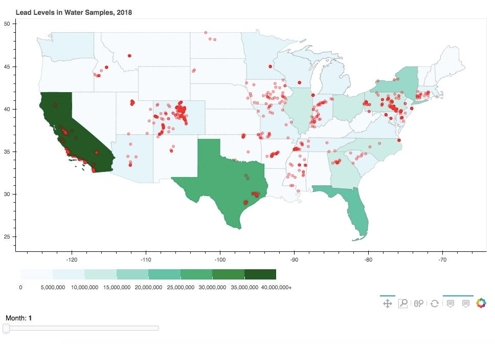
Ex: Visualizing Lead Levels in Water
Goal
Create a map of the contiguous US that shows the state population. Within each state, show where lead was found in 2018.
Creating The Contiguous USA
In order to create a map, you will need a shapefile (.shp). In this case, I downloaded a shapefile from the US Census Bureau here. The file tells Geopandas what shapes we are mapping out. In our case, we need a file that outlines each state in the contiguous US. We use a geometry column so that the Geopandas package knows where to look for information for the shapes of each state. The shapes are shapely Polygon objects in this case.
# Import geopandas package
import geopandas as gpd# Read in shapefile and examine data
contiguous_usa = gpd.read_file('data/cb_2018_us_state_20m.shp')
contiguous_usa.head()


Running the following line of code in a Jupyter Notebook will return an image of Maryland.


But we can cast the geometry element as a string to see how the shapely geometry object is represented:
str(contiguous_usa.iloc[0]['geometry'])
Returns a long string that represents the many polygons that make up Maryland:
'MULTIPOLYGON (((-76.04621299999999 38.025533, -76.00733699999999 38.036706, -75.98008899999999 38.004891, -75.98464799999999 37.938121, -76.04652999999999 37.953586, -76.04621299999999 38.025533))...
Data: State Population
Now that we have an idea of how we will map out the US, we need to combine the geometry of each state with the data we want to plot. In this case, we need to connect each state to its population in 2018. You can find US population estimates by state and year here through the US Census Bureau.
import pandas as pd# Read in state population data and examine
state_pop = pd.read_csv('data/state_pop_2018.csv')
state_pop.head()


Now we know that both the shapefile and the state population csv have a column called “NAME” that we can match together. So now we can merge the files using pandas.
# Merge shapefile with population data
pop_states = contiguous_usa.merge(state_pop, left_on = ‘NAME’, right_on = ‘NAME’)# Drop Alaska and Hawaii
pop_states = pop_states.loc[~pop_states['NAME'].isin(['Alaska', 'Hawaii'])]
Now that we have merged the data and limited it to the contiguous USA, we can convert the data to a format that is conducive to mapping:
import json
from bokeh.io import show
from bokeh.models import (CDSView, ColorBar, ColumnDataSource,
                          CustomJS, CustomJSFilter,
                          GeoJSONDataSource, HoverTool,
                          LinearColorMapper, Slider)
from bokeh.layouts import column, row, widgetbox
from bokeh.palettes import brewer
from bokeh.plotting import figure# Input GeoJSON source that contains features for plotting
geosource = GeoJSONDataSource(geojson = pop_states.to_json())
Now that the data has been converted to the appropriate format, we can plot the map of state populations using the following steps:
- Create the figure object
- Add a patch renderer to the figure
- Create a hover tool
- Show the figure
# Create figure object.
p = figure(title = 'Lead Levels in Water Samples, 2018',
           plot_height = 600 ,
           plot_width = 950,
           toolbar_location = 'below',
           tools = “pan, wheel_zoom, box_zoom, reset”)
p.xgrid.grid_line_color = None
p.ygrid.grid_line_color = None# Add patch renderer to figure.
states = p.patches('xs','ys', source = geosource,
                   fill_color = None,
                   line_color = ‘gray’,
                   line_width = 0.25,
                   fill_alpha = 1)# Create hover tool
p.add_tools(HoverTool(renderers = [states],
                      tooltips = [('State','@NAME'),
                                ('Population','@POPESTIMATE2018')]))show(p)
Now that we’ve created the map, we can add a color bar that will indicate the state population.
# Define color palettes
palette = brewer['BuGn'][8]
palette = palette[::-1] # reverse order of colors so higher values have darker colors# Instantiate LinearColorMapper that linearly maps numbers in a range, into a sequence of colors.
color_mapper = LinearColorMapper(palette = palette, low = 0, high = 40000000)# Define custom tick labels for color bar.
tick_labels = {‘0’: ‘0’, ‘5000000’: ‘5,000,000’,
 ‘10000000’:’10,000,000', ‘15000000’:’15,000,000',
 ‘20000000’:’20,000,000', ‘25000000’:’25,000,000',
 ‘30000000’:’30,000,000', ‘35000000’:’35,000,000',
 ‘40000000’:’40,000,000+’}# Create color bar.
color_bar = ColorBar(color_mapper = color_mapper,
                     label_standoff = 8,
                     width = 500, height = 20,
                     border_line_color = None,
                     location = (0,0),
                     orientation = ‘horizontal’,
                     major_label_overrides = tick_labels)# Create figure object.
p = figure(title = ‘Lead Levels in Water Samples, 2018’,
           plot_height = 600, plot_width = 950,
           toolbar_location = ‘below’,
           tools = “pan, wheel_zoom, box_zoom, reset”)
p.xgrid.grid_line_color = None
p.ygrid.grid_line_color = None# Add patch renderer to figure.
states = p.patches(‘xs’,’ys’, source = geosource,
                   fill_color = {‘field’ :'POPESTIMATE2018',
                                 ‘transform’ : color_mapper},
                   line_color = ‘gray’,
                   line_width = 0.25,
                   fill_alpha = 1)# Create hover tool
p.add_tools(HoverTool(renderers = [states],
                      tooltips = [(‘State’,’@NAME’),
                               (‘Population’, ‘@POPESTIMATE2018’)]))# Specify layout
# p.add_layout(color_bar, ‘below’)show(p)


Data: Lead Levels
Now that we have the basic map down, we can add information about the water sites where lead was found. The data I used was from Water Quality Data. From the data available, I downloaded two datasets:
- All water sites in the US in 2018
- The results from every water sample that was tested for lead for in the US in 2018
sites_df = pd.read_csv('data/sites_2018.csv')
lead_samples = pd.read_csv('data/lead_samples_2018.csv')
After we’ve loaded in the data, we need to examine and clean the data. In this case,Get rid of points with no results for lead, or 0 ug/l of lead. In this case, we only want to plot sites where the test was measured in ug/l or mg/l. We convert the mg/l to ug/l to have consistent units.
After cleaning the data, we can merge the water sites with the lead samples. Then we sort the sites, drop any duplicates, matching on both the site and the day. Then we can subset for water sites that are within the contiguous USA based on latitude and longitude. We then create a month column for plotting purposes. Finally, we create a geometry row by creating shapely geometry Point objects
lead_sites = lead_per_l.merge(sites_no_dup,
                          left_on = ‘MonitoringLocationIdentifier’,
                          right_on = ‘MonitoringLocationIdentifier’)lead_sites_sorted = lead_sites.sort_values(by = ‘ActivityStartDate’)# After dropping duplicates by date, 12,249 data points
lead_sites_dropdup = lead_sites_sorted.drop_duplicates(subset = [‘MonitoringLocationIdentifier’, ‘ActivityStartDate’], keep = ‘last’).reset_index(drop = True)# Drop data points not in the contiguous USA, 10,341 data points
lead_sites_dropdup = lead_sites_dropdup[(lead_sites_dropdup[‘LongitudeMeasure’] <= -60)
                 & (lead_sites_dropdup[‘LongitudeMeasure’] >= -130)
                 & (lead_sites_dropdup[‘LatitudeMeasure’] <= 50)
                 & (lead_sites_dropdup[‘LatitudeMeasure’] >= 20)]# Create Month column for plotting Slider
lead_sites_dropdup[‘Month’] = [int(x.split(‘-’)[1]) for x in lead_sites_dropdup[‘ActivityStartDate’]]# Create shapely.Point objects based on longitude and latitude
geometry = []for index, row in lead_sites_dropdup.iterrows():
    geometry.append(Point(row[‘LongitudeMeasure’],
                          row[‘LatitudeMeasure’]))lead_sites_contig = lead_sites_dropdup.copy()
lead_sites_contig[‘geometry’] = geometry
Now that we have created a suitable geometry column, we can specify the coordinate reference system (crs) and convert the data to a geodataframe. Then we extract the x and y coordinates for plotting purposes and convert to a columndatasource. More information on bokeh data sources can be found here.
# Read dataframe to geodataframe
lead_sites_crs = {‘init’: ‘epsg:4326’}
lead_sites_geo = gpd.GeoDataFrame(lead_sites_contig,
                                  crs = lead_sites_crs,
                             geometry = lead_sites_contig.geometry)# Get x and y coordinates
lead_sites_geo[‘x’] = [geometry.x for geometry in lead_sites_geo[‘geometry’]]
lead_sites_geo[‘y’] = [geometry.y for geometry in lead_sites_geo[‘geometry’]]
p_df = lead_sites_geo.drop(‘geometry’, axis = 1).copy()sitesource = ColumnDataSource(p_df)
Slider Tool
There are a lot of data points (10,000+) and it might make more sense to view the data by time period. So for this example, I divided the data by month, and created a slider tool so that you can view every water site during any month in 2018.
# Make a slider object to toggle the month shown
slider = Slider(title = ‘Month’,
                start = 1, end = 12,
                step = 1, value = 1)
Now that we have created the slider object, we need to update it based on user input. We do this by writing a callback function and a CustomJSFilter.
# This callback triggers the filter when the slider changes
callback = CustomJS(args = dict(source=sitesource),
                    code = """source.change.emit();""")
slider.js_on_change('value', callback)# Creates custom filter that selects the rows of the month based on the value in the slider
custom_filter = CustomJSFilter(args = dict(slider = slider,
                                           source = sitesource),
                               code = """
var indices = [];
// iterate through rows of data source and see if each satisfies some constraint
for (var i = 0; i < source.get_length(); i++){
 if (source.data[‘Month’][i] == slider.value){
 indices.push(true);
 } else {
 indices.push(false);
 }
}
return indices;
""")# Uses custom_filter to determine which set of sites are visible
view = CDSView(source = sitesource, filters = [custom_filter])
Now that we have written our functions, we can plot the water sampling sites, a hover tool for the sites, as well as the slider.
# Plots the water sampling sites based on month in slider
sites = p.circle('x', 'y', source = sitesource, color = 'red',
                 size = 5, alpha = 0.3, view = view)# Add hover tool
p.add_tools(HoverTool(renderers = [sites],
                      tooltips = [('Organization', '@OrganizationFormalName'),
                                  ('Location Type', '@MonitoringLocationTypeName'),
                                  ('Date', '@ActivityStartDate'),
                                  ('Lead (ug/l)', '@LeadValue_ug_l')]))# Make a column layout of widgetbox(slider) and plot, and add it to the current document
layout = column(p, widgetbox(slider))show(layout)
Ways to Improve the Visualization
- Currently, the map only shows population on a state level, but since water samples/sites likely do not serve the entire state, a more minute breakdown of population, for example by county, may be more informative.
- In keeping with 1, it may be interesting to show which area derive their water from these sources.
- Currently, the map does not provide a quick overview of the statistics about lead levels (Ex: least/most lead detected, variance, changes in sites that are recorded multiple times, etc.)
- Visually, there can be improvements in terms of labeling or changing the style of the hover tools.
Resources
- “A Complete Guide to an Interactive Geographical Map using Python.” Towards Data Science (Shivangi Patel, Feb. 5, 2019)
- “Adding Widgets.” Bokeh Documentation.
- “bokeh.models.filters.” Bokeh Documentation.
- “bokeh.models.sources.” Bokeh Documentation.
- GeoPandas Documentation
- “GeoPandas 101: Plot any data with a latitude and longitude on a map.” (Ryan Stewart, Oct. 31, 2018)
- How to use a slider callback to filter a ColumnDataSource in Bokeh using Python 3? Stack Overflow.
- “Interactive maps with Bokeh.” University of Helsinki.
- “Javascript Callbacks.” Bokeh Documentation.
- The Shapely User Manual


No comments:
Post a Comment