Working with datasets on a daily basis has made it easier for me to read and understand table statistics. However, while numeric statistics might give you the essence of your data, a graph or visualization can uncover a whole new dimension of underlying information within your dataset.
When it comes to presenting your data, especially to clients, it’s always good to use visualization tools that can help bring out the scope and purpose of your work. You wouldn’t want just to show data files or code, rather a neat set of graphs to make your story seem more plausible and lucid.
However, creating a scatter plot for any set of data doesn’t mean you’re good to go. When visualizing data, it is important to understand 3 things.
- What are the different types of plots you can use?
- How many should you use and how would you explain them?
- Can you tell a story using just these plots? What do they tell you?
Below, you will find the visualization types, different kinds of plots, when to use them and when not to. I tried to include examples wherever I could, but if you have any questions unanswered here, feel free to post in the comments.
Additionally, if you want to perfect the art of Data Visualization, you need to have a deep understanding of the different visualization types and plots. I’ll add some resources at the end of this read for those interested.
Additionally, if you want to perfect the art of Data Visualization, you need to have a deep understanding of the different visualization types and plots. I’ll add some resources at the end of this read for those interested.
Visualization Types
Temporal Visualization
Typically done for one-dimensional data, showing some sort of linear relationship between data points. Such datasets usually involve time as an independent variable and thus, time-series data is visualized in this way.
Plot-types: Scatter-plots, Gantt charts, Timelines, Time-Series Line plots.
Plot-types: Scatter-plots, Gantt charts, Timelines, Time-Series Line plots.
Network Visualization
As the name suggests, Network Visualization is about connecting multiple datasets with each other and showing how they relate with one another in a network where each variable is connected.
Plot-types: Node-link diagrams, Matrix plots, Alluvial & Dependency plots.
Plot-types: Node-link diagrams, Matrix plots, Alluvial & Dependency plots.
Hierarchical Visualization
Used when the dataset contains ordered variables connected to each other. It can be used to show the relationship between parent and child variables, especially when the data can be clustered under different categories.
Plot-types: Tree diagrams, Dendrograms, Sunburst diagrams, Ring charts.
Plot-types: Tree diagrams, Dendrograms, Sunburst diagrams, Ring charts.
Multi-dimensional Visualization
These types of plots are used when there multiple dimensions, and it is possible to create a 3D diagram in certain instances. Although they might be inherently complex, Multi-dimensional plots can host a ton of data (and insights).
Ploy-types: 2D/3D Histograms, 2D/3D Scatter, Pie, Bar, Line plots.
Ploy-types: 2D/3D Histograms, 2D/3D Scatter, Pie, Bar, Line plots.
Plot Types
Bar plots
Commonly used due to the ease of understanding data through them. This might be the most basic way to present data, but it can be useful in achieving results through simplicity and clarity. Below is an example of how to create a barplot on seaborn. Right below the code is the output.
Import Seaborn as sb
ds = {'Day':['Mon', 'Tue', 'Wed', 'Thu', 'Fri'], 'Hours':[8,7,11,9,6]}
dx = pd.DataFrame(ds)
sb.barplot(x='Day', y='Hours', data=dx)


When to use:- Comparing a few variables in the same category or datasets with similar variables.
- Tracking the progression of a few (1 or 2) variables over time.
- Tracking the progression of a few (1 or 2) variables over time.
When not to use:- More than 3 categories of variables
- Visualizing continuous data.
- Visualizing continuous data.
Line plots
Line plots are also very common. When comparing stock prices, or analyzing views of a video over time, line plots can be found pretty much everywhere. The main benefit is that they are very intuitive and the reader can instantly grasp on to the results.
sb.relplot(x='Day', y='Hours', kind='line', data=dx)


When to use:
- Tracking and comparing several variables across time.
- Analyzing trends and variation
- Predicting future values.
- Tracking and comparing several variables across time.
- Analyzing trends and variation
- Predicting future values.
When not to use:
- Getting a general overview of your data.
- Analyzing individual components or sections.
- Getting a general overview of your data.
- Analyzing individual components or sections.
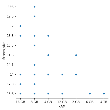
Scatter plots
Scatter plots also have a variety of applications like the other two plot types mentioned above. They can be used to describe relationships, look at individual sections of data, and describe the distribution of data.
scatplot = sb.relplot(x="RAM", y="Screen_size", data=data)

When to use:
- Analyzing individual points
- Outlier analysis and understanding fluctuations
- Getting a general overview of variables.
- Analyzing individual points
- Outlier analysis and understanding fluctuations
- Getting a general overview of variables.
When not to use:
- Looking for precision
- One-dimensional data.
- Non-numeric/categorical data.
- Looking for precision
- One-dimensional data.
- Non-numeric/categorical data.
Area plots
Area plots might be the closest thing to Line plots on this list, however, there’s a key difference between the two as well. Area charts are able to highlight the difference or distance between different variables, allowing us to see how different items compare against each other to create a whole.
x=range(0,5)
y=[ [0,5,6,1,2], [4,2,1,8,4], [9,6,3,2,4] ]
plt.stackplot(x,y)


When to use:
- Analyzing how parts of a whole progress in a time-series
- Most use cases of line plots
- Analyzing how parts of a whole progress in a time-series
- Most use cases of line plots
When not to use:
- Presenting parts of a whole over a single period.
- Presenting parts of a whole over a single period.
Other plots

- Pie Charts
When: Comparing parts of a whole or relative values.
When not: Comparing data that doesn’t add up to form a whole.

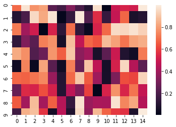
Heat Map
ud= np.random.rand(10, 15)
sb.heatmap(ud)
When: Relationships between two variables.
When not: Individual variables.


Histogram
np.random.normal(size=60)
sb.distplot(x)
When: A few variables or datasets across time.
When not: More than 3 variables or datasets.

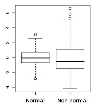
- Box plots
When: Analyzing or Comparing the distribution of a dataset.
When not: Analyzing individual datasets.

- TreeMap
When: Comparing variables in categorical data.
When not: Non-categorical data.


No comments:
Post a Comment