How to customize Seaborn Correlation Heatmaps
I first encountered the utility of Seaborn’s heatmap when investigating the Ames, Iowa housing data for a project at General Assembly. Because the dataset had 80 features, before any feature-engineering, I had to do some good-ole-fashioned EDA.
The best thing about the heatmap is that it can show the Pearson correlation coefficient for each feature to every other feature. It’s a great way to gain insight into your data during EDA and I found quite a few different ways to customize the heatmap to suit your specific needs and make it easier to understand.
Let me demonstrate some of those techniques with a pretty simple example given during my program that was based on the speed dating dataset from Kaggle. It has lots of features but for this example, we’ll only look at five features for now.
To implement a basic heatmap, there are only three imports needed.
import pandas as pd
import seaborn as sns
import matplotlib.pyplot as plt
From there you can create a basic plot by just putting the correlation of the dataframe into a Seaborn heatmap.
plt.figure(figsize=(5,5))
sns.heatmap(dating_subjective.corr());


But that simple heatmap is a bit hard to read. How do you know which values are more correlated than others just by the color? The scale is quite confusing and there is lots of duplication. It’s just plain ugly.
The first thing I normally do is to set the minimum value for the color scale at -1.
plt.figure(figsize=(5,5))
sns.heatmap(subjective.corr(),
            vmin=-1);
Seaborn naturally puts the lowest correlation number as the minimum value for the scale even if it’s a positive correlation. This should be fine for most use-cases but I think it’s nice to know whether correlations are negative or positive quickly.
The next way to make your heatmap more visually pleasing is to use a more divergent color map. The default color map gradually changes from the least to most correlated instead of diverging in the middle between positively and negatively correlated. There are a lot of really great divergent color maps I found from Chris Albion’s website but I generally use ‘coolwarm’.
plt.figure(figsize=(5,5))
sns.heatmap(subjective.corr(),
            vmin=-1,
            cmap='coolwarm');
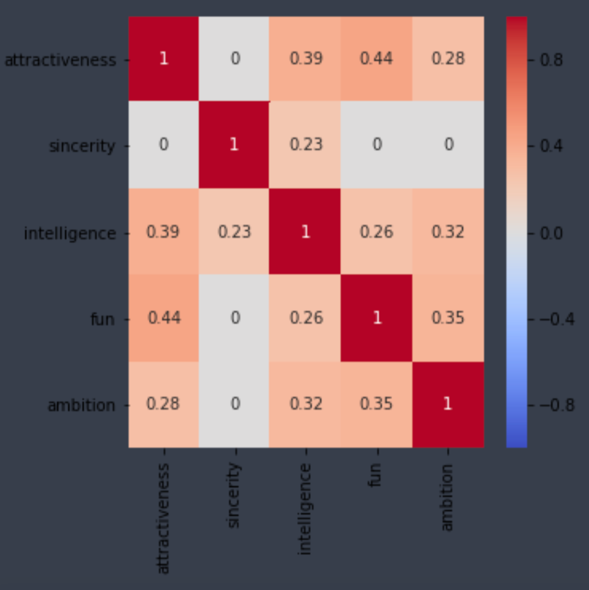
And the last readability tweak I usually do is to add the annotations for each of the correlations. With a small amount of features it doesn’t get too crowded but it can quickly get out of hand.
plt.figure(figsize=(5,5))
sns.heatmap(subjective.corr(),
            vmin=-1,
            cmap='coolwarm',
            annot=True);
So what do we end up with after all those changes?


Much better! The correlations are annotated and it’s clear immediately that all the features are positively correlated.
So what else can we do to make things easier to read?
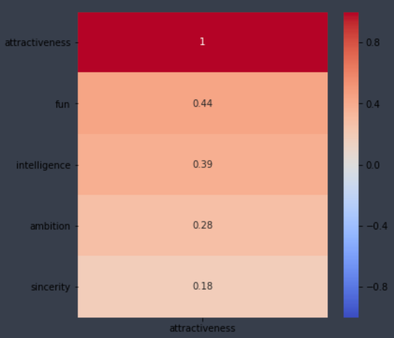
If you want to only see the correlations for one specific feature, you simply have to index that one column.
plt.figure(figsize=(6,6))
sns.heatmap(subjective_corr[['attractiveness']],
            vmin=-1,
            cmap='coolwarm',
            annot=True);
You can also sort those correlations as well.
plt.figure(figsize=(6,6))
sns.heatmap(subjective_corr[['attractiveness']].sort_values(by=['attractiveness'],ascending=False),
            vmin=-1,
            cmap='coolwarm',
            annot=True);

Another way of filtering out correlations is by saving your correlation to a variable, then creating a mask that makes all values below a certain value zero. (You also have to import numpy as np)
subjective_corr = subjective.corr()subjective_corr[np.abs(subjective_corr)<.2] = 0plt.figure(figsize=(5,5))
sns.heatmap(subjective_corr,
            vmin=-1,
            vmax=1,
            cmap='coolwarm',
            annot=True);

And the last trick I learned was to filter out the top half of the correlation matrix because of it’s simply a duplication of the bottom half. It also filters out the diagonal correlations of 1 where features are being compared to themselves.
mask = np.zeros_like(subjective_corr, dtype=np.bool)
mask[np.triu_indices_from(mask)] = Trueplt.figure(figsize=(5,5))
sns.heatmap(subjective_corr,
            vmin=-1,
            cmap='coolwarm',
            annot=True,
            mask = mask);


Take Aways
There are a ton of ways to customize heatmap plots in Seaborn to make them not only more aesthetically pleasing but more readable, especially with large data sets.
These are in no way an exhaustive list of customizations but they are a great starting point to work from.


No comments:
Post a Comment