seaborn.heatmap
seaborn.heatmap(data, vmin=None, vmax=None, cmap=None, center=None, robust=False, annot=None, fmt='.2g', annot_kws=None, linewidths=0, linecolor='white', cbar=True, cbar_kws=None, cbar_ax=None, square=False, xticklabels='auto', yticklabels='auto', mask=None, ax=None, **kwargs)- Plot rectangular data as a color-encoded matrix.This is an Axes-level function and will draw the heatmap into the currently-active Axes if none is provided to the
axargument. Part of this Axes space will be taken and used to plot a colormap, unlesscbaris False or a separate Axes is provided tocbar_ax.Parameters: data : rectangular dataset2D dataset that can be coerced into an ndarray. If a Pandas DataFrame is provided, the index/column information will be used to label the columns and rows.vmin, vmax : floats, optionalValues to anchor the colormap, otherwise they are inferred from the data and other keyword arguments.cmap : matplotlib colormap name or object, or list of colors, optionalThe mapping from data values to color space. If not provided, the default will depend on whethercenteris set.center : float, optionalThe value at which to center the colormap when plotting divergant data. Using this parameter will change the defaultcmapif none is specified.robust : bool, optionalIf True andvminorvmaxare absent, the colormap range is computed with robust quantiles instead of the extreme values.annot : bool or rectangular dataset, optionalIf True, write the data value in each cell. If an array-like with the same shape asdata, then use this to annotate the heatmap instead of the raw data.fmt : string, optionalString formatting code to use when adding annotations.annot_kws : dict of key, value mappings, optionalKeyword arguments forax.textwhenannotis True.linewidths : float, optionalWidth of the lines that will divide each cell.linecolor : color, optionalColor of the lines that will divide each cell.cbar : boolean, optionalWhether to draw a colorbar.cbar_kws : dict of key, value mappings, optionalKeyword arguments for fig.colorbar.cbar_ax : matplotlib Axes, optionalAxes in which to draw the colorbar, otherwise take space from the main Axes.square : boolean, optionalIf True, set the Axes aspect to “equal” so each cell will be square-shaped.xticklabels, yticklabels : “auto”, bool, list-like, or int, optionalIf True, plot the column names of the dataframe. If False, don’t plot the column names. If list-like, plot these alternate labels as the xticklabels. If an integer, use the column names but plot only every n label. If “auto”, try to densely plot non-overlapping labels.mask : boolean array or DataFrame, optionalIf passed, data will not be shown in cells wheremaskis True. Cells with missing values are automatically masked.ax : matplotlib Axes, optionalAxes in which to draw the plot, otherwise use the currently-active Axes.kwargs : other keyword argumentsAll other keyword arguments are passed toax.pcolormesh.Returns: ax : matplotlib AxesAxes object with the heatmap.See alsoclustermap- Plot a matrix using hierachical clustering to arrange the rows and columns.
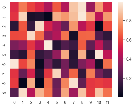
ExamplesPlot a heatmap for a numpy array:>>> import numpy as np; np.random.seed(0) >>> import seaborn as sns; sns.set() >>> uniform_data = np.random.rand(10, 12) >>> ax = sns.heatmap(uniform_data)
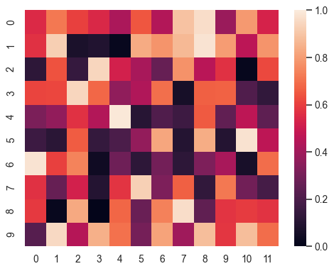
 Change the limits of the colormap:
>>> ax = sns.heatmap(uniform_data, vmin=0, vmax=1)
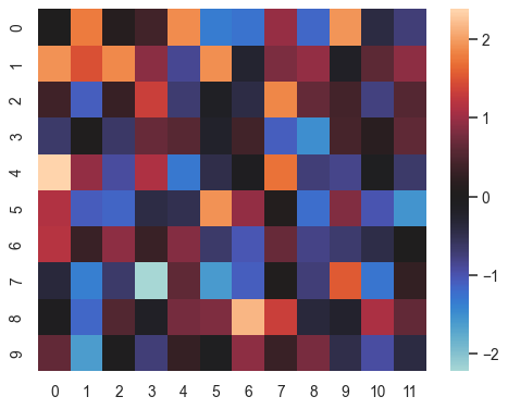
 Plot a heatmap for data centered on 0 with a diverging colormap:
>>> normal_data = np.random.randn(10, 12)
>>> ax = sns.heatmap(normal_data, center=0)
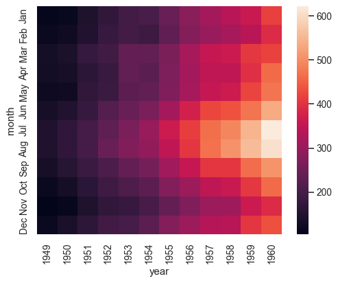
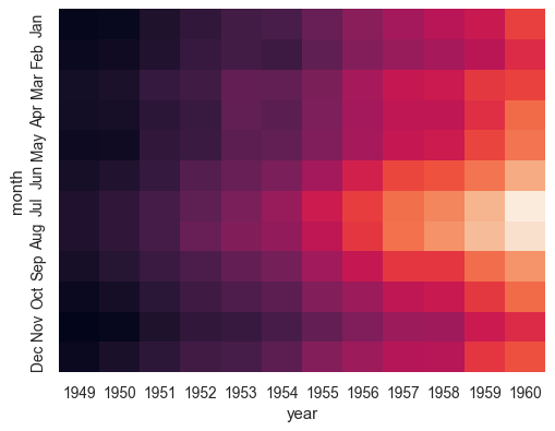
 Plot a dataframe with meaningful row and column labels:
>>> flights = sns.load_dataset("flights")
>>> flights = flights.pivot("month", "year", "passengers")
>>> ax = sns.heatmap(flights)
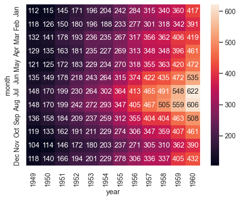
 Annotate each cell with the numeric value using integer formatting:
>>> ax = sns.heatmap(flights, annot=True, fmt="d")
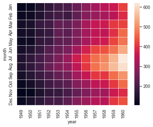
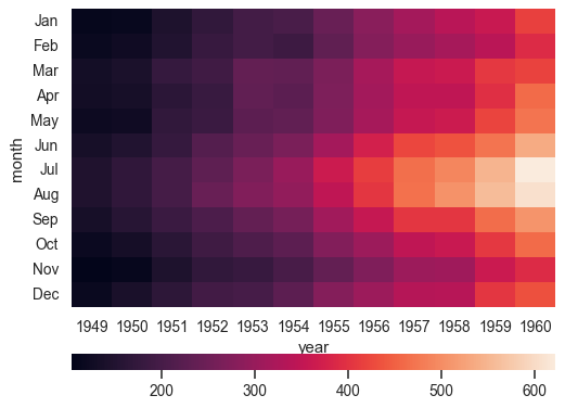
 Add lines between each cell:
>>> ax = sns.heatmap(flights, linewidths=.5)
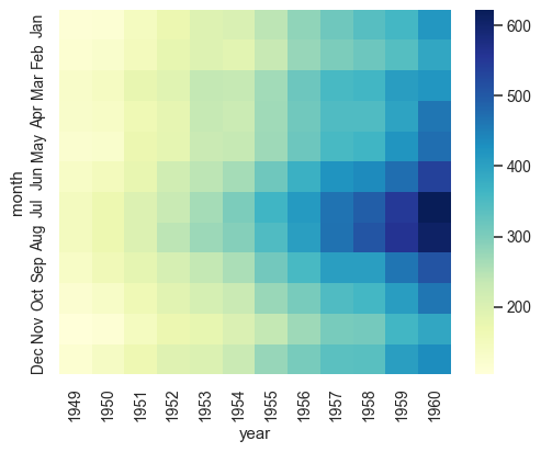
 Use a different colormap:
>>> ax = sns.heatmap(flights, cmap="YlGnBu")
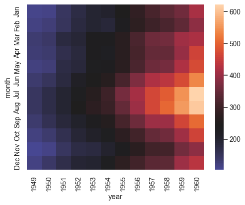
 Center the colormap at a specific value:
>>> ax = sns.heatmap(flights, center=flights.loc["January", 1955])
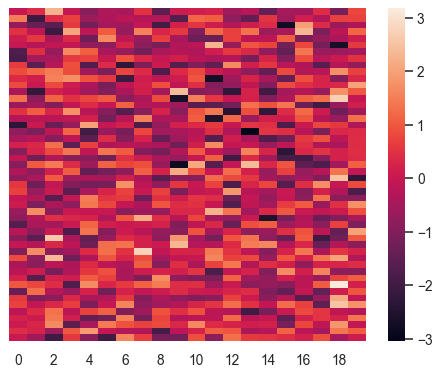
 Plot every other column label and don’t plot row labels:
>>> data = np.random.randn(50, 20)
>>> ax = sns.heatmap(data, xticklabels=2, yticklabels=False)
 Don’t draw a colorbar:
>>> ax = sns.heatmap(flights, cbar=False)
 Use different axes for the colorbar:
>>> grid_kws = {"height_ratios": (.9, .05), "hspace": .3}
>>> f, (ax, cbar_ax) = plt.subplots(2, gridspec_kw=grid_kws)
>>> ax = sns.heatmap(flights, ax=ax,
...                  cbar_ax=cbar_ax,
...                  cbar_kws={"orientation": "horizontal"})
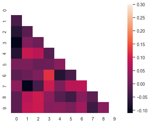
 Use a mask to plot only part of a matrix
>>> corr = np.corrcoef(np.random.randn(10, 200))
>>> mask = np.zeros_like(corr)
>>> mask[np.triu_indices_from(mask)] = True
>>> with sns.axes_style("white"):
...     ax = sns.heatmap(corr, mask=mask, vmax=.3, square=True)


No comments:
Post a Comment