Do you need simple layout samples for Flutter?
I present you my set of Flutter layout code snippets. I will keep it short, sweet and simple with loads of visual examples.
Still, it is work in progress — the catalogue of samples will grow. I will focus more on the usage of Flutter widgets rather than showcasing the components (Flutter Gallery is great for that!).
If you have an issue with “layouting” your Flutter or you wanna share your snippets with others, please drop a line!
In case you are interested in a similar article about Animations, then visit Flutter Animations Cheat Sheet.
Table of Contents
- Row and Column
- IntrinsicWidth and IntrinsicHeight
- Stack
- Expanded
- ConstrainedBox
- Align New
- Container
decoration: BoxDecoration
• image: DecorationImage
• border: Border
• borderRadius: BorderRadius
• shape: BoxShape
• boxShadow: List<BoxShadow>
• gradient: RadialGradient
• backgroundBlendMode: BlendMode - Material
• shape: BeveledRectangleBorder - Slivers
• SliverFillRemaining - SizedBox
- SafeArea
Row and Column
MainAxisAlignment


Row /*or Column*/(
  mainAxisAlignment: MainAxisAlignment.start,
  children: <Widget>[
    Icon(Icons.star, size: 50),
    Icon(Icons.star, size: 50),
    Icon(Icons.star, size: 50),
  ],
),


Row /*or Column*/(
  mainAxisAlignment: MainAxisAlignment.center,
  children: <Widget>[
    Icon(Icons.star, size: 50),
    Icon(Icons.star, size: 50),
    Icon(Icons.star, size: 50),
  ],
),
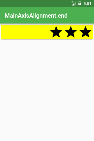


Row /*or Column*/(
  mainAxisAlignment: MainAxisAlignment.end,
  children: <Widget>[
    Icon(Icons.star, size: 50),
    Icon(Icons.star, size: 50),
    Icon(Icons.star, size: 50),
  ],
),


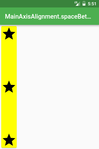
Row /*or Column*/(
  mainAxisAlignment: MainAxisAlignment.spaceBetween,
  children: <Widget>[
    Icon(Icons.star, size: 50),
    Icon(Icons.star, size: 50),
    Icon(Icons.star, size: 50),
  ],
),


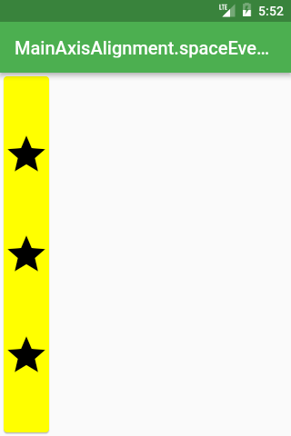
Row /*or Column*/(
  mainAxisAlignment: MainAxisAlignment.spaceEvenly,
  children: <Widget>[
    Icon(Icons.star, size: 50),
    Icon(Icons.star, size: 50),
    Icon(Icons.star, size: 50),
  ],
),


Row /*or Column*/(
  mainAxisAlignment: MainAxisAlignment.spaceAround,
  children: <Widget>[
    Icon(Icons.star, size: 50),
    Icon(Icons.star, size: 50),
    Icon(Icons.star, size: 50),
  ],
),

You should use CrossAxisAlignment.baseline if you require for the baseline of different text be aligned.
Row(
  crossAxisAlignment: CrossAxisAlignment.baseline,
  textBaseline: TextBaseline.alphabetic,
  children: <Widget>[
    Text(
      'Baseline',
      style: Theme.of(context).textTheme.display3,
    ),
    Text(
      'Baseline',
      style: Theme.of(context).textTheme.body1,
    ),
  ],
),
CrossAxisAlignment


Row /*or Column*/(
  crossAxisAlignment: CrossAxisAlignment.start,
  children: <Widget>[
    Icon(Icons.star, size: 50),
    Icon(Icons.star, size: 200),
    Icon(Icons.star, size: 50),
  ],
),


Row /*or Column*/(
  crossAxisAlignment: CrossAxisAlignment.center,
  children: <Widget>[
    Icon(Icons.star, size: 50),
    Icon(Icons.star, size: 200),
    Icon(Icons.star, size: 50),
  ],
),
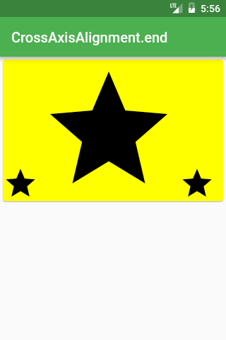

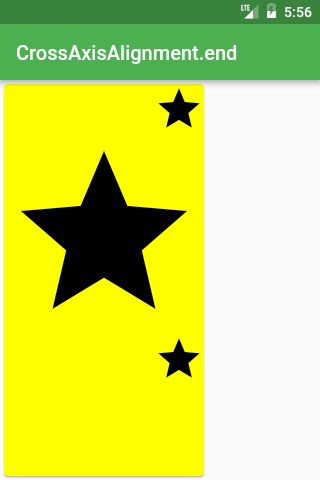
Row /*or Column*/(
  crossAxisAlignment: CrossAxisAlignment.end,
  children: <Widget>[
    Icon(Icons.star, size: 50),
    Icon(Icons.star, size: 200),
    Icon(Icons.star, size: 50),
  ],
),
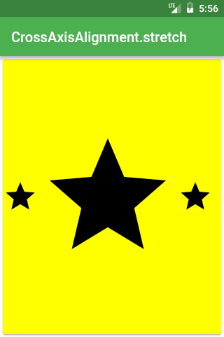


Row /*or Column*/(
  crossAxisAlignment: CrossAxisAlignment.stretch,
  children: <Widget>[
    Icon(Icons.star, size: 50),
    Icon(Icons.star, size: 200),
    Icon(Icons.star, size: 50),
  ],
),
MainAxisSize


Row /*or Column*/(
  mainAxisSize: MainAxisSize.max,
  children: <Widget>[
    Icon(Icons.star, size: 50),
    Icon(Icons.star, size: 50),
    Icon(Icons.star, size: 50),
  ],
),
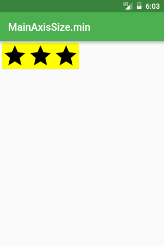


Row /*or Column*/(
  mainAxisSize: MainAxisSize.min,
  children: <Widget>[
    Icon(Icons.star, size: 50),
    Icon(Icons.star, size: 50),
    Icon(Icons.star, size: 50),
  ],
),
IntrinsicWidth and IntrinsicHeight
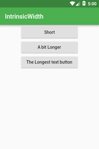
Want all the widgets inside Row or Column to be as tall/wide as the tallest/widest widget? Search no more!
In case you have this kind of layout:


Widget build(BuildContext context) {
  return Scaffold(
    appBar: AppBar(title: Text('IntrinsicWidth')),
    body: Center(
      child: Column(
        children: <Widget>[
          RaisedButton(
            onPressed: () {},
            child: Text('Short'),
          ),
          RaisedButton(
            onPressed: () {},
            child: Text('A bit Longer'),
          ),
          RaisedButton(
            onPressed: () {},
            child: Text('The Longest text button'),
          ),
        ],
      ),
    ),
  );
}
But you would like to have all buttons as wide as the widest, just use IntrinsicWidth :

Widget build(BuildContext context) {
  return Scaffold(
    appBar: AppBar(title: Text('IntrinsicWidth')),
    body: Center(
      child: IntrinsicWidth(
        child: Column(
          crossAxisAlignment: CrossAxisAlignment.stretch,
          children: <Widget>[
            RaisedButton(
              onPressed: () {},
              child: Text('Short'),
            ),
            RaisedButton(
              onPressed: () {},
              child: Text('A bit Longer'),
            ),
            RaisedButton(
              onPressed: () {},
              child: Text('The Longest text button'),
            ),
          ],
        ),
      ),
    ),
  );
}
In case you have a similar problem but you would like to have all the widgets as tall as the tallest just use a combination of IntrinsicHeight and Row widgets.
Stack
Perfect for overlaying Widgets on top of each other


@override
Widget build(BuildContext context) {
  Widget main = Scaffold(
    appBar: AppBar(title: Text('Stack')),
  );

  return Stack(
    fit: StackFit.expand,
    children: <Widget>[
      main,
      Banner(
        message: "Top Start",
        location: BannerLocation.topStart,
      ),
      Banner(
        message: "Top End",
        location: BannerLocation.topEnd,
      ),
      Banner(
        message: "Bottom Start",
        location: BannerLocation.bottomStart,
      ),
      Banner(
        message: "Bottom End",
        location: BannerLocation.bottomEnd,
      ),
    ],
  );
}
With your own Widgets, you need to place them in Positioned Widget


Widget build(BuildContext context) {
return Scaffold(
appBar: AppBar(title: Text('Stack')),
body: Stack(
fit: StackFit.expand,
children: <Widget>[
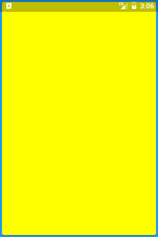
Material(color: Colors.yellowAccent),
Positioned(
top: 0,
left: 0,
child: Icon(Icons.star, size: 50),
),
Positioned(
top: 340,
left: 250,
child: Icon(Icons.call, size: 50),
),
],
),
);
}If you don’t want to guess the top/bottom values you can use LayoutBuilder to retrieve them


Widget build(BuildContext context) {
  const iconSize = 50;
  return Scaffold(
    appBar: AppBar(title: Text('Stack with LayoutBuilder')),
    body: LayoutBuilder(
      builder: (context, constraints) =>
        Stack(
          fit: StackFit.expand,
          children: <Widget>[
            Material(color: Colors.yellowAccent),
            Positioned(
              top: 0,
              child: Icon(Icons.star, size: iconSize),
            ),
            Positioned(
              top: constraints.maxHeight - iconSize,
              left: constraints.maxWidth - iconSize,
              child: Icon(Icons.call, size: iconSize),
            ),
          ],
        ),
    ),
  );
}
Expanded
Expanded works with Flex\Flexbox layout and is great for distributing space between multiple items.


Row(
  children: <Widget>[
    Expanded(
      child: Container(
        decoration: const BoxDecoration(color: Colors.red),
      ),
      flex: 3,
    ),
    Expanded(
      child: Container(
        decoration: const BoxDecoration(color: Colors.green),
      ),
      flex: 2,
    ),
    Expanded(
      child: Container(
        decoration: const BoxDecoration(color: Colors.blue),
      ),
      flex: 1,
    ),
  ],
),
ConstrainedBox
By default, most of the widgets will use as little space as possible:


Card(child: const Text('Hello World!'), color: Colors.yellow)ConstrainedBox allows a widget to use the remaining space as desired.


ConstrainedBox(
  constraints: BoxConstraints.expand(),
  child: const Card(
    child: const Text('Hello World!'),
    color: Colors.yellow,
  ),
),
Using BoxConstraints you specify how much space a widget can have — you specify min/max of height/width.
BoxConstraints.expand uses infinite (all the available) amount of space unless specified:

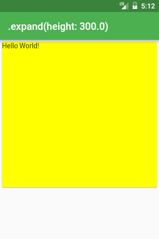
ConstrainedBox(
  constraints: BoxConstraints.expand(height: 300),
  child: const Card(
    child: const Text('Hello World!'),
    color: Colors.yellow,
  ),
),
And it’s the same as:
ConstrainedBox(
  constraints: BoxConstraints(
    minWidth: double.infinity,
    maxWidth: double.infinity,
    minHeight: 300,
    maxHeight: 300,
  ),
  child: const Card(
    child: const Text('Hello World!'),
    color: Colors.yellow,
  ),
),
Align
Sometimes you struggle to set our widget to a proper size — for example, it is constantly stretch when you do not want to:

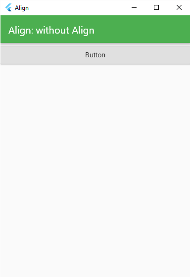
The above happens for example when you have a Column with CrossAxisAlignment.stretch and you want only for the button not to be stretched:

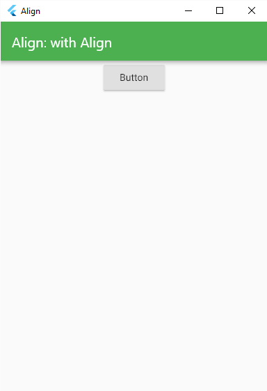
Widget build(BuildContext context) {
  return Scaffold(
    appBar: AppBar(title: Text('Align: without Align')),
    body: Column(
      crossAxisAlignment: CrossAxisAlignment.stretch,
      children: <Widget>[
        Align(
          child: RaisedButton(
            onPressed: () {},
            child: const Text('Button'),
          ),
        ),
      ],
    ),
  );
}
Always when your widget does not listen to the constraints that you try to set up, first try to wrap it with Align .
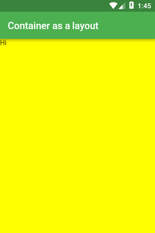
Container
One of the most used Widgets — and for good reasons:
Container as a layout tool
When you don’t specify the height and the width of the Container, it will match its child’s size


Widget build(BuildContext context) {
  return Scaffold(
    appBar: AppBar(title: Text('Container as a layout')),
    body: Container(
      color: Colors.yellowAccent,
      child: Text("Hi"),
    ),
  );
}
If you want to stretch the Container to match its parent, use double.infinity for the height and width properties

Widget build(BuildContext context) {
  return Scaffold(
    appBar: AppBar(title: Text('Container as a layout')),
    body: Container(
      height: double.infinity,
      width: double.infinity,
      color: Colors.yellowAccent,
      child: Text("Hi"),
    ),
  );
}
Container as decoration
You can use color property to affect Container’s background but decoration and foregroundDecoration. (With those two properties, you can completely change how Container looks like but I will be talking about different decorations later as it quite a big topic)decoration is always placed behind the child, whereas foregroundDecoration is on top of the child


Widget build(BuildContext context) {
  return Scaffold(
    appBar: AppBar(title: Text('Container.decoration')),
    body: Container(
      height: double.infinity,
      width: double.infinity,
      decoration: BoxDecoration(color: Colors.yellowAccent),
      child: Text("Hi"),
    ),
  );
}
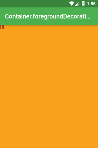
Widget build(BuildContext context) {
  return Scaffold(
    appBar: AppBar(title: Text('Container.foregroundDecoration')),
    body: Container(
      height: double.infinity,
      width: double.infinity,
      decoration: BoxDecoration(color: Colors.yellowAccent),
      foregroundDecoration: BoxDecoration(
        color: Colors.red.withOpacity(0.5),
      ),
      child: Text("Hi"),
    ),
  );
}
Container as Transform
If you don’t want to use Transform widget to change your layout, you can use transform property straight from the Container


Widget build(BuildContext context) {
  return Scaffold(
    appBar: AppBar(title: Text('Container.transform')),
    body: Container(
      height: 300,
      width: 300,
      transform: Matrix4.rotationZ(pi / 4),
      decoration: BoxDecoration(color: Colors.yellowAccent),
      child: Text(
        "Hi",
        textAlign: TextAlign.center,
      ),
    ),
  );
}
BoxDecoration
The decoration is usually used on a Container widget to change how the container looks.
image: DecorationImage
Puts an image as a background:


Scaffold(
  appBar: AppBar(title: Text('image: DecorationImage')),
  body: Center(
    child: Container(
      height: 200,
      width: 200,
      decoration: BoxDecoration(
        color: Colors.yellow,
        image: DecorationImage(
          fit: BoxFit.fitWidth,
          image: NetworkImage(
            'https://flutter.io/images/catalog-widget-placeholder.png',
          ),
        ),
      ),
    ),
  ),
);
border: Border
Specifies how should the border of the Container look like.


Scaffold(
appBar: AppBar(title: Text('border: Border')),
body: Center(
child: Container(
height: 200,
width: 200,
decoration: BoxDecoration(
color: Colors.yellow,
border: Border.all(color: Colors.black, width: 3),
),
),
),
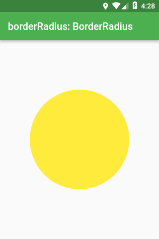
);borderRadius: BorderRadius
Enables border corners to be rounded.
borderRadius does not work if the shape of the decoration is BoxShape.circle


Scaffold(
  appBar: AppBar(title: Text('borderRadius: BorderRadius')),
  body: Center(
    child: Container(
      height: 200,
      width: 200,
      decoration: BoxDecoration(
        color: Colors.yellow,
        border: Border.all(color: Colors.black, width: 3),
        borderRadius: BorderRadius.all(Radius.circular(18)),
      ),
    ),
  ),
);
shape: BoxShape
Box decoration can be either a rectangle/square or an ellipse/circle.
For any other shape, you can use ShapeDecoration instead of BoxDecoration

Scaffold(
  appBar: AppBar(title: Text('shape: BoxShape')),
  body: Center(
    child: Container(
      height: 200,
      width: 200,
      decoration: BoxDecoration(
        color: Colors.yellow,
        shape: BoxShape.circle,
      ),
    ),
  ),
);
boxShadow: List<BoxShadow>
Adds shadow to the Container.
This parameter is a list because you can specify multiple different shadows and merge them together.


Scaffold(
  appBar: AppBar(title: Text('boxShadow: List<BoxShadow>')),
  body: Center(
    child: Container(
      height: 200,
      width: 200,
      decoration: BoxDecoration(
        color: Colors.yellow,
        boxShadow: const [
          BoxShadow(blurRadius: 10),
        ],
      ),
    ),
  ),
);
gradient
There are three types of gradients: LinearGradient, RadialGradient and SweepGradient.

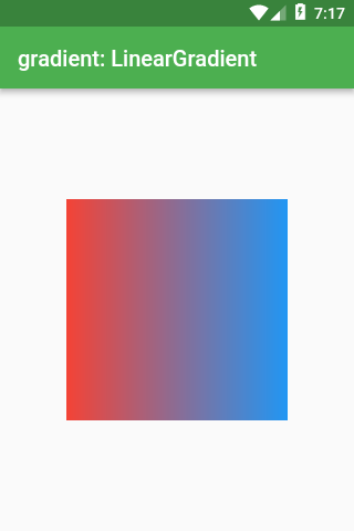
LinearGradientScaffold(
appBar: AppBar(title: Text('gradient: LinearGradient')),
body: Center(
child: Container(
height: 200,
width: 200,
decoration: BoxDecoration(
gradient: LinearGradient(
colors: const [
Colors.red,
Colors.blue,
],
),
),
),
),
);

Scaffold(
  appBar: AppBar(title: Text('gradient: RadialGradient')),
  body: Center(
    child: Container(
      height: 200,
      width: 200,
      decoration: BoxDecoration(
        gradient: RadialGradient(
          colors: const [Colors.yellow, Colors.blue],
          stops: const [0.4, 1.0],
        ),
      ),
    ),
  ),
);
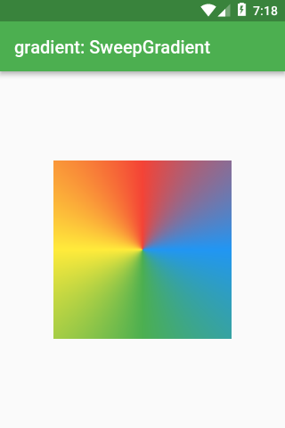
Scaffold(
appBar: AppBar(title: Text('gradient: SweepGradient')),
body: Center(
child: Container(
height: 200,
width: 200,
decoration: BoxDecoration(
gradient: SweepGradient(
colors: const [
Colors.blue,
Colors.green,
Colors.yellow,
Colors.red,
Colors.blue,
],
stops: const [0.0, 0.25, 0.5, 0.75, 1.0],
),
),
),
),
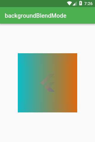
);backgroundBlendMode
backgroundBlendMode is the most complex property of BoxDecoration.
It’s responsible for mixing together colors/gradients of BoxDecoration and whatever BoxDecoration is on top of.
With backgroundBlendMode you can use a long list of algorithms specified in BlendMode enum.
First, let’s set BoxDecoration as foregroundDecoration which is drawn on top of Container’s child (whereas decoration is drawn behind the child).

Scaffold(
  appBar: AppBar(title: Text('backgroundBlendMode')),
  body: Center(
    child: Container(
      height: 200,
      width: 200,
      foregroundDecoration: BoxDecoration(
        backgroundBlendMode: BlendMode.exclusion,
        gradient: LinearGradient(
          colors: const [
            Colors.red,
            Colors.blue,
          ],
        ),
      ),
      child: Image.network(
        'https://flutter.io/images/catalog-widget-placeholder.png',
      ),
    ),
  ),
);
backgroundBlendMode does not affect only the Container it’s located in.
backgroundBlendMode changes the color of anything that is up the widget tree from the Container.
The following code has a parent Container that draws an image and child Container that uses backgroundBlendMode. Still, you would get the same effect as previously.


Scaffold(
  appBar: AppBar(title: Text('backgroundBlendMode')),
  body: Center(
    child: Container(
      decoration: BoxDecoration(
        image: DecorationImage(
          image: NetworkImage(
            'https://flutter.io/images/catalog-widget-placeholder.png',
          ),
        ),
      ),
      child: Container(
        height: 200,
        width: 200,
        foregroundDecoration: BoxDecoration(
          backgroundBlendMode: BlendMode.exclusion,
          gradient: LinearGradient(
            colors: const [
              Colors.red,
              Colors.blue,
            ],
          ),
        ),
      ),
    ),
  ),
);
Material
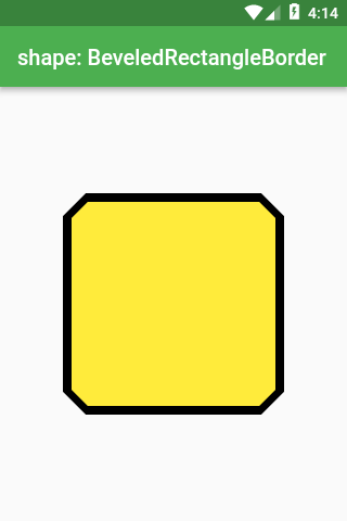
Border with cut corners

Scaffold(
  appBar: AppBar(title: Text('shape: BeveledRectangleBorder')),
  body: Center(
    child: Material(
      shape: const BeveledRectangleBorder(
        borderRadius: BorderRadius.all(Radius.circular(20)),
        side: BorderSide(color: Colors.black, width: 4),
      ),
      color: Colors.yellow,
      child: Container(
        height: 200,
        width: 200,
      ),
    ),
  ),
);
Slivers
SliverFillRemaining
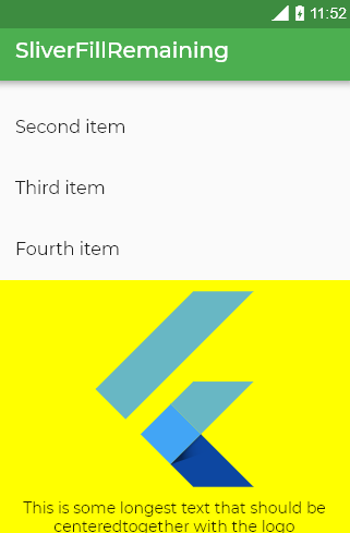
This Widget is irreplaceable when you want to center your content even if there is not enough space for it. Interactive example


Scaffold(
  appBar: AppBar(title: Text('SliverFillRemaining')),
  body: CustomScrollView(
    slivers: [
      SliverFillRemaining(
        hasScrollBody: false,
        child: Column(
          mainAxisAlignment: MainAxisAlignment.center,
          children: const [
            FlutterLogo(size: 200),
            Text(
              'This is some longest text that should be centered'
              'together with the logo',
              textAlign: TextAlign.center,
            ),
          ],
        ),
      ),
    ],
  ),
);
In case there is no enough space for the centred content, SliverFillRemaining will become scrollable:


If it was not for SliverFillRemaining , the content would overflow like this:


Filling the remaining space
Apart from being useful for centering your content, SliverFillRemaining will fill the remainings viewport’s free space. To do that this widget has to be placed in CustomScrollView and needs to be the last sliver


In case there is not enough space, the widget becomes scrollable:

Scaffold(
  appBar: AppBar(title: Text('SliverFillRemaining')),
  body: CustomScrollView(
    slivers: [
      SliverList(
        delegate: SliverChildListDelegate(const [
          ListTile(title: Text('First item')),
          ListTile(title: Text('Second item')),
          ListTile(title: Text('Third item')),
          ListTile(title: Text('Fourth item')),
        ]),
      ),
      SliverFillRemaining(
        hasScrollBody: false,
        child: Container(
          color: Colors.yellowAccent,
          child: Column(
            mainAxisAlignment: MainAxisAlignment.center,
            children: const [
              FlutterLogo(size: 200),
              Text(
                'This is some longest text that should be centered'
                'together with the logo',
                textAlign: TextAlign.center,
              ),
            ],
          ),
        ),
      ),
    ],
  ),
);
SizedBox
It’s one of the simplest but most useful Widgets
SizedBox as ConstrainedBox
SizedBox can work in a similar fashion as ConstrainedBox


SizedBox.expand(
  child: Card(
    child: Text('Hello World!'),
    color: Colors.yellowAccent,
  ),
),
SizedBox as padding
When in need of adding padding or margin, you might choose Padding or Container widgets. But they can be more verbose and less readable than adding a Sizedbox


Column(
  children: <Widget>[
    Icon(Icons.star, size: 50),
    const SizedBox(height: 100),
    Icon(Icons.star, size: 50),
    Icon(Icons.star, size: 50),
  ],
),
SizedBox as an Invisible Object
Many time you would like to hide/show a widget depending on a bool


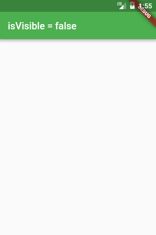
Widget build(BuildContext context) {
  bool isVisible = ...
  return Scaffold(
    appBar: AppBar(
      title: Text('isVisible = $isVisible'),
    ),
    body: isVisible
      ? Icon(Icons.star, size: 150)
      : const SizedBox(),
  );
}
Because SizedBox has a const constructor, using const SizedBox() is really cheap**.
** One cheaper solution would be to use Opacity widget and change the opacity value to 0.0 . The drawback of this solution is that the given widget would be only invisible, still would occupy the space.
SafeArea
On different platforms, there are special areas like Status Bar on Android or the Notch on iPhone X that we might avoid drawing under.
The solution to this problem is SafeArea widget (example without/with SafeArea)


Widget build(BuildContext context) {
  return Material(
    color: Colors.blue,
    child: SafeArea(
      child: SizedBox.expand(
        child: Card(color: Colors.yellowAccent),
      ),
    ),
  );
}
In case you have a question that is important to you and don’t want me to miss it, you can send me a private message at twitter.


No comments:
Post a Comment