Let’s see the main libraries for data visualization with Python and all the types of charts that can be done with them. We will also see which library is recommended to use on each occasion and the unique capabilities of each library.
We will start with the most basic visualization that is looking at the data directly, then we will move on to plotting charts and finally, we will make interactive charts.
Datasets
We will work with two datasets that will adapt to the visualizations we show in the article, the datasets can be downloaded here.
They are data on the popularity of searches on the Internet for three terms related to artificial intelligence (data science, machine learning and deep learning). They have been extracted from a famous search engine.
There are two files temporal.csv and mapa.csv. The first one we will use in the vast majority of the tutorial includes popularity data of the three terms over time (from 2004 to the present, 2020). In addition, I have added a categorical variable (ones and zeros) to demonstrate the functionality of charts with categorical variables.
The file mapa.csv includes popularity data separated by country. We will use it in the last section of the article when working with maps.
Pandas
Before we move on to more complex methods, let’s start with the most basic way of visualizing data. We will simply use pandas to take a look at the data and get an idea of how it is distributed.
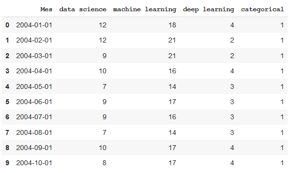
The first thing we must do is visualize a few examples to see what columns there are, what information they contain, how the values are coded…
import pandas as pd
df = pd.read_csv('temporal.csv')
df.head(10) #View first 10 data rows

With the command describe we will see how the data is distributed, the maximums, the minimums, the mean, …
df.describe()


With the info command we will see what type of data each column includes. We could find the case of a column that when viewed with the head command seems numeric but if we look at subsequent data there are values in string format, then the variable will be coded as a string.
df.info()


By default, pandas limits the number of rows and columns it displays. This bothers me usually because I want to be able to visualize all the data.


With these commands, we increase the limits and we can visualize the whole data. Be careful with this option for big datasets, we can have problems showing them.
pd.set_option('display.max_rows', 500)
pd.set_option('display.max_columns', 500)
pd.set_option('display.width', 1000)
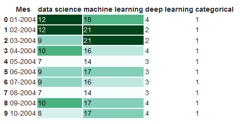
Using Pandas styles, we can get much more information when viewing the table. First, we define a format dictionary so that the numbers are shown in a legible way (with a certain number of decimals, date and hour in a relevant format, with a percentage, with a currency, …) Don’t panic, this is only a display and does not change the data, you will not have any problem to process it later.
To give an example of each type, I have added currency and percentage symbols even though they do not make any sense for this data.
format_dict = {'data science':'${0:,.2f}', 'Mes':'{:%m-%Y}', 'machine learning':'{:.2%}'}#We make sure that the Month column has datetime format
df['Mes'] = pd.to_datetime(df['Mes'])#We apply the style to the visualization
df.head().style.format(format_dict)
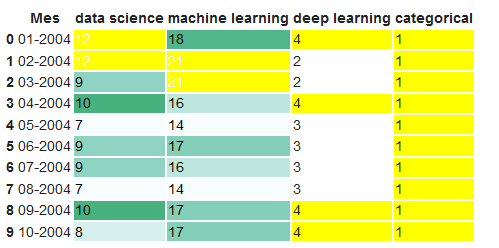
We can highlight maximum and minimum values with colours.
format_dict = {'Mes':'{:%m-%Y}'} #Simplified format dictionary with values that do make sense for our data
df.head().style.format(format_dict).highlight_max(color='darkgreen').highlight_min(color='#ff0000')


We use a color gradient to display the data values.
df.head(10).style.format(format_dict).background_gradient(subset=['data science', 'machine learning'], cmap='BuGn')

We can also display the data values with bars.
df.head().style.format(format_dict).bar(color='red', subset=['data science', 'deep learning'])


Moreover, we also can combine the above functions and generate a more complex visualization.
df.head(10).style.format(format_dict).background_gradient(subset=['data science', 'machine learning'], cmap='BuGn').highlight_max(color='yellow')

Learn more about styling visualizations with Pandas here: https://pandas.pydata.org/pandas-docs/stable/user_guide/style.html
Pandas Profiling
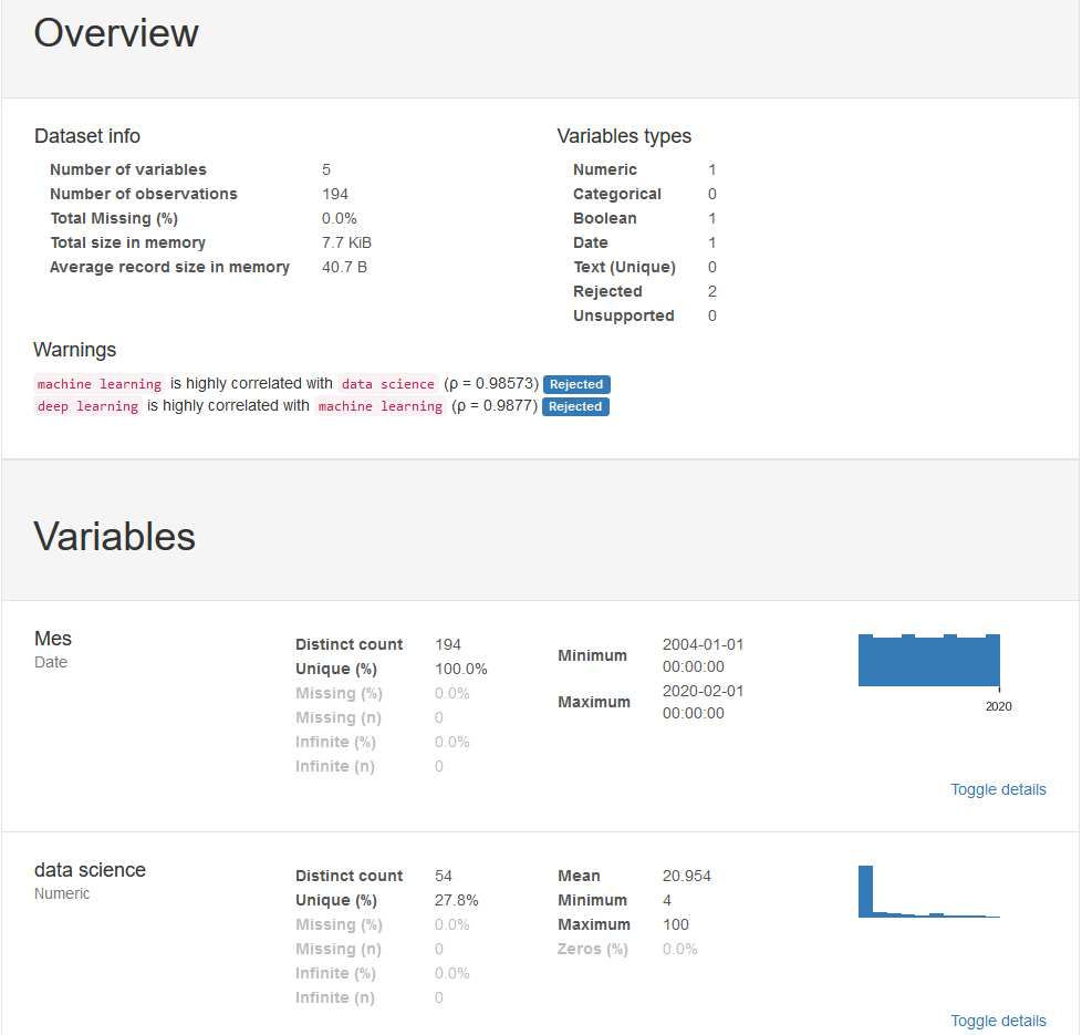
Pandas profiling is a library that generates interactive reports with our data, we can see the distribution of the data, the types of data, possible problems it might have. It is very easy to use, with only 3 lines we can generate a report that we can send to anyone and that can be used even if you do not know programming.
from pandas_profiling import ProfileReport
prof = ProfileReport(df)
prof.to_file(output_file='report.html')

You can see the interactive report generated from the data used in the article, here.
You can find more information about Pandas Profiling in this article.
Matplotlib
Matplotlib is the most basic library for visualizing data graphically. It includes many of the graphs that we can think of. Just because it is basic does not mean that it is not powerful, many of the other data visualization libraries we are going to talk about are based on it.
Matplotlib’s charts are made up of two main components, the axes (the lines that delimit the area of the chart) and the figure (where we draw the axes, titles and things that come out of the area of the axes). Now let’s create the simplest graph possible:
import matplotlib.pyplot as plt
plt.plot(df['Mes'], df['data science'], label='data science') #The parameter label is to indicate the legend. This doesn't mean that it will be shown, we'll have to use another command that I'll explain later.


We can make the graphs of multiple variables in the same graph and thus compare them.
plt.plot(df['Mes'], df['data science'], label='data science')
plt.plot(df['Mes'], df['machine learning'], label='machine learning')
plt.plot(df['Mes'], df['deep learning'], label='deep learning')

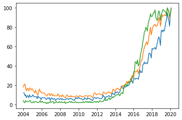
It is not very clear which variable each color represents. We’re going to improve the chart by adding a legend and titles.
plt.plot(df['Mes'], df['data science'], label='data science')
plt.plot(df['Mes'], df['machine learning'], label='machine learning')
plt.plot(df['Mes'], df['deep learning'], label='deep learning')
plt.xlabel('Date')
plt.ylabel('Popularity')
plt.title('Popularity of AI terms by date')
plt.grid(True)
plt.legend()


If you are working with Python from the terminal or a script, after defining the graph with the functions we have written above use plt.show(). If you’re working from jupyter notebook, add %matplotlib inline to the beginning of the file and run it before making the chart.
We can make multiple graphics in one figure. This goes very well for comparing charts or for sharing data from several types of charts easily with a single image.
fig, axes = plt.subplots(2,2)
axes[0, 0].hist(df['data science'])
axes[0, 1].scatter(df['Mes'], df['data science'])
axes[1, 0].plot(df['Mes'], df['machine learning'])
axes[1, 1].plot(df['Mes'], df['deep learning'])


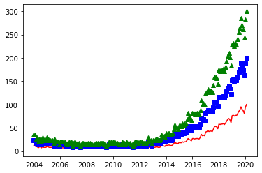
We can draw the graph with different styles for the points of each variable:
plt.plot(df['Mes'], df['data science'], 'r-')
plt.plot(df['Mes'], df['data science']*2, 'bs')
plt.plot(df['Mes'], df['data science']*3, 'g^')

Now let’s see a few examples of the different graphics we can do with Matplotlib. We start with a scatterplot:
plt.scatter(df['data science'], df['machine learning'])


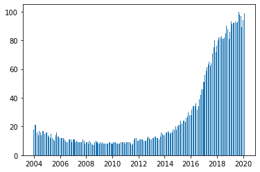
Example of a bar chart:
plt.bar(df['Mes'], df['machine learning'], width=20)

Example of a histogram:
plt.hist(df['deep learning'], bins=15)


We can add a text to the graphic, we indicate the position of the text in the same units that we see in the graphic. In the text, we can even add special characters following the TeX language
We can also add markers that point to a particular point on the graph.
plt.plot(df['Mes'], df['data science'], label='data science')
plt.plot(df['Mes'], df['machine learning'], label='machine learning')
plt.plot(df['Mes'], df['deep learning'], label='deep learning')
plt.xlabel('Date')
plt.ylabel('Popularity')
plt.title('Popularity of AI terms by date')
plt.grid(True)
plt.text(x='2010-01-01', y=80, s=r'$\lambda=1, r^2=0.8$') #Coordinates use the same units as the graph
plt.annotate('Notice something?', xy=('2014-01-01', 30), xytext=('2006-01-01', 50), arrowprops={'facecolor':'red', 'shrink':0.05})


Gallery of examples:
In this link: https://matplotlib.org/gallery/index.html we can see examples of all types of graphics that can be done with Matplotlib.
In this link: https://matplotlib.org/gallery/index.html we can see examples of all types of graphics that can be done with Matplotlib.
Seaborn
Seaborn is a library based on Matplotlib. Basically what it gives us are nicer graphics and functions to make complex types of graphics with just one line of code.
We import the library and initialize the style of the graphics with sns.set(), without this command the graphics would still have the same style as Matplotlib. We show one of the simplest graphics, a scatterplot
import seaborn as sns
sns.set()
sns.scatterplot(df['Mes'], df['data science'])


We can add information of more than two variables in the same graph. For this we use colors and sizes. We also make a different graph according to the value of the category column:
sns.relplot(x='Mes', y='deep learning', hue='data science', size='machine learning', col='categorical', data=df)


One of the most popular graphics provided by Seaborn is the heatmap. It is very common to use it to show all the correlations between variables in a dataset:
sns.heatmap(df.corr(), annot=True, fmt='.2f')


Another of the most popular is the pairplot that shows us the relationships between all the variables. Be careful with this function if you have a large dataset, as it has to show all the data points as many times as there are columns, it means that by increasing the dimensionality of the data, the processing time increases exponentially.
sns.pairplot(df)


Now let’s do the pairplot showing the charts segmented according to the values of the categorical variable
sns.pairplot(df, hue='categorical')


A very informative graph is the jointplot that allows us to see a scatterplot together with a histogram of the two variables and see how they are distributed:
sns.jointplot(x='data science', y='machine learning', data=df)


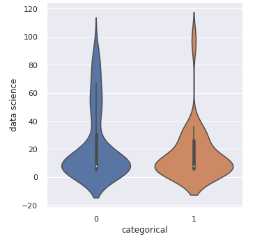
Another interesting graphic is the ViolinPlot:
sns.catplot(x='categorical', y='data science', kind='violin', data=df)

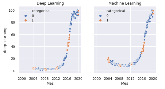
We can create multiple graphics in one image just like we did with Matplotlib:
fig, axes = plt.subplots(1, 2, sharey=True, figsize=(8, 4))
sns.scatterplot(x="Mes", y="deep learning", hue="categorical", data=df, ax=axes[0])
axes[0].set_title('Deep Learning')
sns.scatterplot(x="Mes", y="machine learning", hue="categorical", data=df, ax=axes[1])
axes[1].set_title('Machine Learning')

Bokeh
Bokeh is a library that allows you to generate interactive graphics. We can export them to an HTML document that we can share with anyone who has a web browser.
It is a very useful library when we are interested in looking for things in the graphics and we want to be able to zoom in and move around the graphic. Or when we want to share them and give the possibility to explore the data to another person.
We start by importing the library and defining the file in which we will save the graph:
from bokeh.plotting import figure, output_file, save
output_file('data_science_popularity.html')
We draw what we want and save it on the file:
p = figure(title='data science', x_axis_label='Mes', y_axis_label='data science')
p.line(df['Mes'], df['data science'], legend='popularity', line_width=2)
save(p)


You can see how the file data_science_popularity.html looks by clicking here. It’s interactive, you can move around the graphic and zoom in as you like
Adding multiple graphics to a single file:
output_file('multiple_graphs.html')s1 = figure(width=250, plot_height=250, title='data science')
s1.circle(df['Mes'], df['data science'], size=10, color='navy', alpha=0.5)
s2 = figure(width=250, height=250, x_range=s1.x_range, y_range=s1.y_range, title='machine learning') #share both axis range
s2.triangle(df['Mes'], df['machine learning'], size=10, color='red', alpha=0.5)
s3 = figure(width=250, height=250, x_range=s1.x_range, title='deep learning') #share only one axis range
s3.square(df['Mes'], df['deep learning'], size=5, color='green', alpha=0.5)p = gridplot([[s1, s2, s3]])
save(p)


You can see how the file multiple_graphs.html looks by clicking here.
Gallery of examples:
In this link https://docs.bokeh.org/en/latest/docs/gallery.html you can see examples of everything that can be done with Bokeh.
In this link https://docs.bokeh.org/en/latest/docs/gallery.html you can see examples of everything that can be done with Bokeh.
Altair
Altair, in my opinion, does not bring anything new to what we have already discussed with the other libraries, and therefore I will not talk about it in depth. I want to mention this library because maybe in their gallery of examples we can find some specific graphic that can help us.


Gallery of examples:
In this link you can find the gallery of examples with all you can do with Altair.
In this link you can find the gallery of examples with all you can do with Altair.
Folium
Folium is a library that allows us to draw maps, markers and we can also draw our data on them. Folium lets us choose the map supplier, this determines the style and quality of the map. In this article, for simplicity, we’re only going to look at OpenStreetMap as a map provider.
Working with maps is quite complex and deserves its own article. Here we’re just going to look at the basics and draw a couple of maps with the data we have.
Let’s begin with the basics, we’ll draw a simple map with nothing on it.
import folium
m1 = folium.Map(location=[41.38, 2.17], tiles='openstreetmap', zoom_start=18)
m1.save('map1.html')


We generate an interactive file for the map in which you can move and zoom as you wish. You can see it here.
We can add markers to the map:
m2 = folium.Map(location=[41.38, 2.17], tiles='openstreetmap', zoom_start=16)folium.Marker([41.38, 2.176], popup='<i>You can use whatever HTML code you want</i>', tooltip='click here').add_to(m2)
folium.Marker([41.38, 2.174], popup='<b>You can use whatever HTML code you want</b>', tooltip='dont click here').add_to(m2)m2.save('map2.html')


You can see the interactive map file where you can click on the markers by clicking here.
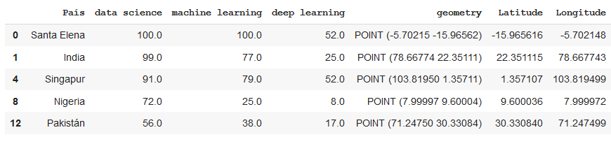
In the dataset presented at the beginning, we have country names and the popularity of the terms of artificial intelligence. After a quick visualization you can see that there are countries where one of these values is missing. We are going to eliminate these countries to make it easier. Then we will use Geopandas to transform the country names into coordinates that we can draw on the map.
from geopandas.tools import geocode
df2 = pd.read_csv('mapa.csv')
df2.dropna(axis=0, inplace=True)df2['geometry'] = geocode(df2['País'], provider='nominatim')['geometry'] #It may take a while because it downloads a lot of data.
df2['Latitude'] = df2['geometry'].apply(lambda l: l.y)
df2['Longitude'] = df2['geometry'].apply(lambda l: l.x)

Now that we have the data coded in latitude and longitude, let’s represent it on the map. We’ll start with a BubbleMap where we’ll draw circles over the countries. Their size will depend on the popularity of the term and their colour will be red or green depending on whether their popularity is above a value or not.
m3 = folium.Map(location=[39.326234,-4.838065], tiles='openstreetmap', zoom_start=3)def color_producer(val):
 if val <= 50:
  return 'red'
 else:
  return 'green'for i in range(0,len(df2)):
 folium.Circle(location=[df2.iloc[i]['Latitud'], df2.iloc[i]['Longitud']], radius=5000*df2.iloc[i]['data science'], color=color_producer(df2.iloc[i]['data science'])).add_to(m3)m3.save('map3.html')


You can view the interactive map file by clicking here.
Which library to use at any given time?
With all this variety of libraries you may be wondering which library is best for your project. The quick answer is the library that allows you to easily make the graphic you want.
For the initial phases of a project, with pandas and pandas profiling we will make a quick visualization to understand the data. If we need to visualize more information we could use simple graphs that we can find in matplotlib as scatterplots or histograms.
For advanced phases of the project, we can search the galleries of the main libraries (Matplotlib, Seaborn, Bokeh, Altair) for the graphics that we like and fit the project. These graphics can be used to give information in reports, make interactive reports, search for specific values, …


No comments:
Post a Comment