Introduction
In this post we explore the shifting focus of Data Engineering from Data Infrastructure and Data Integration to Accessible Analytics, in Meta and the industry at large. However the tools that we use are largely focused on the former two which presents a major challenge for the function. We will showcase challenges this mismatch created during the evolution of Data Engineering at Meta and will formulate the properties of a next-generation data platform. In subsequent posts we will review how Data Engineering at Meta is evolving to address these challenges.
But first let’s define what we mean by Accessible Analytics. We are not using the term Accessible Analytics as it is commonly understood, i.e., the act of making data accessible for extracting insights through tools. Instead, we are also drawing attention to the fact that for data to truly be deemed accessible it will have to be self-describing to an extent that it doesn’t require specialized skills to draw meaningful insights from it.
The evolving role of the Data Engineer
Let’s take a look at what Functions modern analytics teams serve, and also what business Outcomes they drive via their Work Product.

As the analytics organization matures, the focus of data engineering shifts from the bottom layers of the pyramid to the top. Often times the first data engineers in the company spend most of their time setting up the data infrastructure. As the company grows, requirements for analytics will also grow, which is typically addressed by investing more engineering rigor into creating data assets. At first, this primarily involves writing ETL pipelines to build foundational datasets (i.e., data integration). However, the focus eventually shifts more towards creating abstractions for consistent analysis, enabling analytic applications on top of them.
What is an analytic application? An analytic application is a software program or platform that processes, manages, and presents data in a meaningful way to support decision-making, analysis, or automation. To give an example, consider a “what if analysis” spreadsheet calculating revenue and growth rate for a startup based on sales and marketing projections, something many of you will be familiar with. It’s an analytics application that was built for decision making and was used to generate insights. Creating a spreadsheet each time someone wants to look at the metrics is inconvenient, so typically people prefer to create a dashboard instead, which is a more advanced kind of an analytic application.
In a mature analytics team data engineers spend an increasing amount of time on the below activities:
- Making sure that the data foundation is consistently representing the underlying business enabling consumers — be it data analysts querying a table or business users looking at a dashboard — to draw accurate conclusions without spending a lot of effort on trying to understand the data.
- Building high quality analytic applications for example:
- Interactive data exploration (dashboards) — Enabling end users to access data without having knowledge of SQL or the underlying nuances of each dataset.
- Common analysis workflow automation — Automating routine tasks such as alerts to stakeholders upon significant metric movement or A/B testing results.
- Reverse ETL — Sharing relevant metrics with operational systems (e.g. CRM, ERP) derived from the data warehouse.
The main goal of these activities is to make the process of drawing insights from data, more accessible to both specialist and non-specialist users. Achieving consistently modeled high quality data at scale necessitates shared representation of business concepts, in other words shared schema and business logic. Consequently the data development workflow has to adopt software engineering best practices such as reusable abstractions to share the concepts and automated testing to ensure quality. Consistent abstraction-based data modeling makes data more accessible not only to humans but also to systems, unlocking a variety of automation opportunities.
The below diagram shows how the focus areas of data engineering shift as the analytics organization evolves.

Based upon this illustration, we can observe three distinct focus areas for the role:
- Data Infrastructure: One example of a problem being solved in this instance might be setting up a spark cluster for users to issue HQL queries against data on S3.
- Data Integration: An example task would be creating a dataset via SQL query, joining tens of other datasets, and then scheduling the query to run daily using the orchestration framework.
- Data Accessibility: An example could be enabling end-users to analyze significant metrics movements in a self-serve manner.
In the upcoming sections we’ll explore the journey towards Accessible Analytics at Meta and how we are evolving our tooling and development workflow to solve these challenges.
The evolution of Data Engineering at Meta
The evolution of the data engineer at Meta from Data Integration to Accessible Analytics has primarily been influenced by ever-increasing scale, analytics complexity and privacy. The underlying data infrastructure and the data development lifecycle correspondingly have continued to evolve throughout.
We have been working toward evolving the role of Data Engineering from merely building data pipelines to integrate disunited and heterogeneous data processing stacks (across logging, batch, real time, ML etc.) to writing richer, smarter and modular analytic applications on unified data processing stacks (i.e., unified metadata, language, lineage etc.). Disunited refers to the siloed and disconnected nature of the various development workflows (e.g.,authoring, consuming, operating) that arise due to data processing across databases, compute engines, metadata and storage repositories.
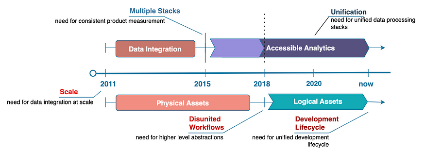
Data Integration: Data at Scale
In the early years at Meta, Data Engineering was small and centralized. There was a big appetite for data and insights into the performance of a rapidly growing product ecosystem. The objective was to integrate the data at scale and build curated datasets, primarily for exploration, reporting and experimentation. The purpose of data integration was to unify metrics & dimensions produced in siloed ETL systems and scale common analytical patterns, as the picture below depicts. Specifically, we built frameworks and tools to automate data processing by abstracting away compute and storage. In a nutshell, we wrote code — what some might call Functional ETL — to generate SQL queries along with a DAG of tasks to be executed given a data processing specification.
Of course, we have since moved away from templatizing formatted SQL strings to dataframe-type constructs to ensure correctness of the generated SQL. For the same reason, we are also moving away from configuration-driven business logic generation at run-time (i.e., dynamic) versus at authoring-time (i.e., static).
Regardless, in the early years, these patterns were essential in enabling us to scale the function of Data Engineering!
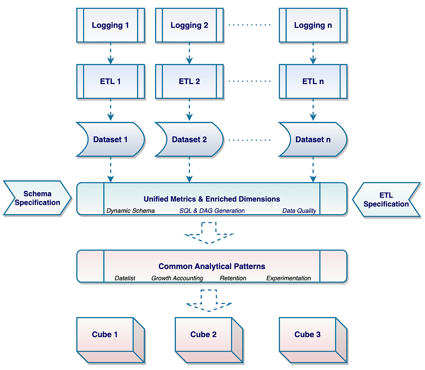
Product Measurement: Multiple Data Processing Stacks
Over the years, Meta has grown to become a family of apps, exponentially increasing the number of users and interactions. Needless to say, this resulted in enormous growth in both data and data engineers. The objective of our function was to influence product strategy through consistent product measurement and insights. This led to the analytics function being embedded within product teams and, consequently, data engineering becoming decentralized. Diversity in product ecosystems led to a corresponding diversity in analytics use cases and data ecosystems. The demand for insights led to an explosion of data processing. There were a multitude of analytics use cases (such as understanding performance across product workflows, predictive analytics and so on) across the entire data processing landscape. Our data infrastructure scaled accordingly, as the picture below depicts.

Development Lifecycle: End-to-End Workflows
In time, logging evolved to become more consistent with reusable event schema specifications, type-safety, and validation. Pipeline authoring continued to become more modular in nature, driven by shared business logic. Meanwhile, the data engineering development lifecycle across the various data processing stacks was becoming increasingly interconnected. Consequently, we made tremendous progress in advancing the end-to-end authoring and operational life cycle, as seen in the picture below. This was critical in enabling Data Engineers at Meta to continue to build high quality datasets. These datasets continue to power critical dashboards, core experiments and strategic analyses in the company.

Analytics Complexity & Privacy: Higher Level Abstractions
Meanwhile, the product ecosystem was becoming more connected and unified bringing with it an ever increasing set of challenging analytics scenarios and, at the same time, heightened privacy requirements.
On the one hand, the cross-product experience needed to be consistently measured (i.e., data-modeled and definitionally aligned) across siloed data sources and data processing stacks. We built a semantic layer (i.e., metric abstractions) to unify the business representation of data at the end of all the data processing to enable a consistent consumption experience. These days, unsurprisingly, we are seeing a lot of excitement around similar versions of semantic layers. However, we needed semantic metadata to be reusable and governed across the entire data processing dependency graph, not just at the end of all the processing a metric undergoes from its origin as a business process event. As seen below, a hypothetical metric that counts actions (some_action.id) cannot be consistently consumed without a shared data model closer to the event source (some_action_event) in addition to the lineage of definitional transformations the metric undergoes across every stage of data processing.

On the other hand, policy-driven use of personal data needed to be enforced in every data processing instance across the same gigantic dependency graph. As should be evident from the picture below, we needed to apply a global lens to institute privacy-forward policies that respect user consent for data use. To ensure compliance, we needed unified privacy and security metadata across the entire data lineage.
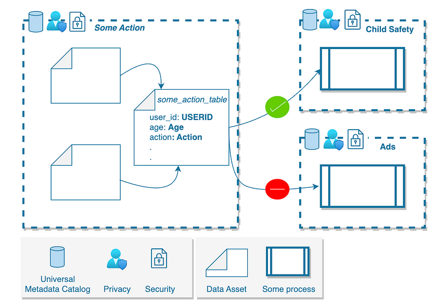
Unsurprisingly, both scenarios (analytics and privacy) require trying to understand the meaning and purpose of data across a very vast data lineage.
In simplest terms:
- What does the data in the columns mean?
- Where does the data in the columns flow?
Challenges with Disunited Workflows
Nowhere in the data engineering workflow are we explicitly encoding meaning and purpose. Meaning and purpose are logical concepts that require semantically richer constructs (i.e., logical datasets with richer, more descriptive, column types). Meanwhile, all the production and consumption (for over a decade!!) has implicitly happened on physical constructs (i.e., relationship unaware physical tables with primitive column types). In the long run, stitching together a consistent and purpose-aware data flow through a semantically poor set of disunited stacks becomes a monumental task. Thus making consistent product measurement while enforcing privacy constraints challenging across a vastly siloed data lineage.
Inconsistent Representation
Specifically, consider this hypothetical data table (some_user_table) in the picture below. A table like this would most likely have been produced in a batch pipeline, several levels downstream of some event in the online world (i.e., way upstream outside of the data warehouse):

One can observe that the schema, which is defined through primitive types, doesn’t convey the meaning of these sensitive columns. In fact, the meaning was never propagated throughout the lineage of transformations, starting from its origin. Dynamic (i.e., MAPs) and unstructured (i.e., JSON) schemas complicate this even further. In this hypothetical example, one cannot answer questions about this data such as:
- Where did that user_id column come from?
- What is in the country column? Is that country name or code? Are the values consistent with ISO standards?
- What are the privacy policies on the data? What purposes can age be used for and not?
However trustworthy the data might be, any analytics on such data must inevitably be limited in the long run.
Inconsistent Business Logic
To make matters worse, a data engineer will have to be adept at accounting for differences in the SQL dialect, not just in defining schema (i.e., VARCHAR vs STRING between Spark and Presto) but also in writing common business logic. Consider a simple function that brackets age. We should be able to define this canonical logic in one place and reuse it across all data processing stacks (batch or real time) without duplication. Instead, it continues to be repeated to suit the context of the data application.

In reality, the business logic is usually much more complex with different flavors of SQL constructs (i.e. UDFs, Broadcast JOINs etc.) involving attributes from different entities (i.e. user, content). Needless to say, the more complex the business logic the higher the risk of inconsistency in it.
Beyond the limitations of physical data assets, we could continue examining many more challenges across the entire development lifecycle — discovering, authoring, governing, change managing, maintaining, and so on. Instead, we will end this note and leave you to ponder the following questions as you reflect upon your data development lifecycle.
- Do you know which of your dataset attributes are dimensions and which are metrics?
- Are you able to define, discover and reuse schema (e.g., ISOAlpha2CountryCode) & business logic (e.g., age_bracket)?
- Do you know which datasets contain canonical values and attributes for a given dimension?
- Are you able to automatically enrich (i.e., age_bracket(..)) your dimensional data in a standardized way?
- Is the source of truth for your schema governed by a database (e.g., Hive Metastore), by a configuration system, by hard to govern naming conventions / wiki’s or by code?
- Can you distinguish your tables based on their function, type and granularity (i.e., staging/private/public, anonymized, fact/dimension/rollup, user/aggregate)?
- How do you ensure correctness of all the SQL that is dynamically generated from templatized string constructs?
- Are you able to validate, change-manage and investigate a new version of data, schema, pipeline or business logic across a sub-graph of the data lineage?
We will dive into how we are answering these questions in the rest of the blog series.
