We use python’s pandas' library primarily for data manipulation in data analysis. But we can use Pandas for data visualization as well. You even do not need to import the Matplotlib library for that. Pandas itself can use Matplotlib in the backend and render the visualization for you. It makes it really easy to makes a plot using a DataFrame or a Series. Pandas use a higher-level API than Matplotlib. So, it can make plots using fewer lines of code.
I will start with the very basic plots using random data and then move to the more advanced one with a real dataset.
I will use a Jupyter notebook environment for this tutorial. If you do not have that installed, you can simply use a Google Colab notebook. You even won’t have to install pandas on it. It already has that installed for us.
If you want a Jupyter notebook installed that’s also a great idea. Please go ahead and install the anaconda package.
It’s a great package for data scientists and it’s free.
Then install pandas using:
pip install pandasor in your anaconda prompt
conda install pandasYou are ready to rock n roll!
Pandas Visualization
We will start with the most basic one.
Line Plot
First import pandas. Then, let’s just make a basic Series in pandas and make a line plot.
import pandas as pd
a = pd.Series([40, 34, 30, 22, 28, 17, 19, 20, 13, 9, 15, 10, 7, 3])
a.plot()

The most basic and simple plot is ready! See, how easy it is. We can improve it a bit.
I will add:
a figure size to make the size of the plot bigger,
color to change the default blue color,
title on top that shows what this plot is about
and font size to change the default font size of those numbers on the axis
a.plot(figsize=(8, 6), color='green', title = 'Line Plot', fontsize=12)

There are a lot more styling techniques we will learn throughout this tutorial.
Area Plot
I will use the same series ‘a’ and make an area plot here,
I can use the .plot() method and pass a parameter kind to specify the kind of plot I want like:
a.plot(kind='area')or I can write like this
a.plot.area()Both of the methods I mentioned above will create this plot:


The area plot makes more sense and also looks nicer when there are several variables in it. So, I will make a couple more Series, make a DataFrme, and make an area plot from it.
b = pd.Series([45, 22, 12, 9, 20, 34, 28, 19, 26, 38, 41, 24, 14, 32])
c = pd.Series([25, 38, 33, 38, 23, 12, 30, 37, 34, 22, 16, 24, 12, 9])
d = pd.DataFrame({'a':a, 'b': b, 'c': c})

Let’s plot this DataFrame ‘d’ as an area plot now,
d.plot.area(figsize=(8, 6), title='Area Plot

You do not have to accept those default colors. Let’s change those colors and add some more style to it.
d.plot.area(alpha=0.4, color=['coral', 'purple', 'lightgreen'],figsize=(8, 6), title='Area Plot', fontsize=12)

Probably the parameter alpha is new to you.
The ‘alpha’ parameter adds some translucent looks to the plot.
It appears to be very useful at times when we have overlapping area plots or histograms or dense scatter plots.
This .plot() function can make eleven types of plots:
- line
- area
- bar
- barh
- pie
- box
- hexbin
- hist
- kde
- density
- scatter
I would like to show the use of all of those different plots. For that, I will use the NHANES dataset by the Centers for Disease Control and Prevention. I downloaded this dataset and kept it in the same folder as this Jupyter notebook. Please feel free to download the dataset and follow along:
Here I import the dataset:
df = pd.read_csv('nhanes_2015_2016.csv')
df.head()

This dataset has 30 columns and 5735 rows.
Before starting to make plots, it is important to check the columns of the dataset:
df.columnsoutput:
Index(['SEQN', 'ALQ101', 'ALQ110', 'ALQ130', 'SMQ020', 'RIAGENDR', 'RIDAGEYR', 'RIDRETH1', 'DMDCITZN', 'DMDEDUC2', 'DMDMARTL', 'DMDHHSIZ', 'WTINT2YR', 'SDMVPSU', 'SDMVSTRA', 'INDFMPIR', 'BPXSY1', 'BPXDI1', 'BPXSY2', 'BPXDI2', 'BMXWT', 'BMXHT', 'BMXBMI', 'BMXLEG', 'BMXARML', 'BMXARMC', 'BMXWAIST', 'HIQ210', 'DMDEDUC2x', 'DMDMARTLx'], dtype='object')The names of the columns might look strange. But do not worry about that. I will keep explaining the meaning of the columns as we go. And we will not use all the columns. We will use some of them to practice these plots.
Histogram
I will use the weight of the population to make a basic histogram.
df['BMXWT'].hist()
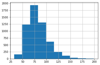
As a reminder, the histogram provides the distribution of frequency. It shows in the picture above that about 1825 people have a weight of 75. The maximum number of people have a weight in the range of 49 to 99.
What if I want to put several histograms in one plot?
I will make three histograms in one plot using weight, height, and body mass index (BMI).
df[['BMXWT', 'BMXHT', 'BMXBMI']].plot.hist(stacked=True, bins=20, fontsize=12, figsize=(10, 8))

But if you want three different histograms that are also possible using just one line of code like this:
df[['BMXWT', 'BMXHT', 'BMXBMI']].hist(bins=20,figsize=(10, 8))

It can be even more dynamic!
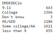
We have systolic blood pressure data in the ‘BPXSY1’ column and the level of education in the ‘DMDEDUC2’ column. If we want to examine the distribution of the systolic blood pressure in the population of each education level, that is also be done in just one line of code.
But before doing that I want to replace the numeric value of the ‘DMDEDUC2’ column with more meaningful string values:
df["DMDEDUC2x"] = df.DMDEDUC2.replace({1: "less than 9", 2: "9-11", 3: "HS/GED", 4: "Some college/AA", 5: "College", 7: "Refused", 9: "Don't know"})Make the histograms now,
df[['DMDEDUC2x', 'BPXSY1']].hist(by='DMDEDUC2x', figsize=(18, 12))

Look! We have the distribution of systolic blood pressure levels for each education level in just one line of code!
Bar Plot
Now let’s see how the systolic blood pressure changes with marital status. This time I will make a bar plot. Like before I will replace the numeric values of the ‘DMDMARTL’ column with more meaningful strings.
df["DMDMARTLx"] = df.DMDMARTL.replace({1: "Married", 2: "Widowed", 3: "Divorced", 4: "Separated", 5: "Never married", 6: "Living w/partner", 77: "Refused"})To make the bar plot we need to preprocess the data. That is to group the data by different marital statuses and take the mean of each group. Here I do the processing of the data and plot in the same line of code.
df.groupby('DMDMARTLx')['BPXSY1'].mean().plot(kind='bar', rot=45, fontsize=10, figsize=(8, 6))

Here we used the ‘rot’ parameter to rotate the x ticks 45 degrees. Otherwise, they will be too cluttered.
If you like, you can make it horizontal as well,
df.groupby('DMDEDUC2x')['BPXSY1'].mean().plot(kind='barh', rot=45, fontsize=10, figsize=(8, 6))

I want to make a bar plot with multiple variables. We have a column that contains the ethnic origin of the population. It will be interesting to see if people’s weight, height, and body mass index change with ethnic origin.
To plot that, we need to group those three columns (weight, height, and body mass index) by ethnic origin and take the mean.
df_bmx = df.groupby('RIDRETH1')['BMXWT', 'BMXHT', 'BMXBMI'].mean().reset_index()
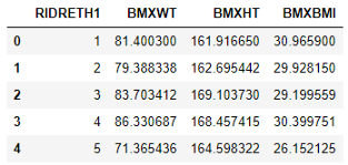
This time I did not change the ethnic origin data. I kept the numeric values as it is. Let’s make our bar plot now,
df_bmx.plot(x = 'RIDRETH1',
            y=['BMXWT', 'BMXHT', 'BMXBMI'],
            kind = 'bar',
            color = ['lightblue', 'red', 'yellow'],
            fontsize=10)

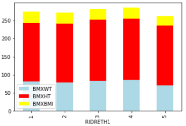
Looks like ethnic group 4 is a little higher than the rest of them. But they are all very close. No significant difference.
We can stack different parameters (weight, height, and body mass index) on top of each other as well.
df_bmx.plot(x = 'RIDRETH1',
            y=['BMXWT', 'BMXHT', 'BMXBMI'],
            kind = 'bar', stacked=True,
            color = ['lightblue', 'red', 'yellow'],
            fontsize=10)
Pie Plot
Here I want to check if marital status and education have any relation.
I need to group the marital status by education level and count the population in each marital status group by education level. Sound too wordy, right? Let’s see it:
df_edu_marit = df.groupby('DMDEDUC2x')['DMDMARTL'].count()
pd.Series(df_edu_marit)
Using this Series make a pie plot very easily:
ax = pd.Series(df_edu_marit).plot.pie(subplots=True, label='',
     labels = ['College Education', 'high school',
     'less than high school', 'Some college',
     'HS/GED', 'Unknown'],
     figsize = (8, 6),
     colors = ['lightgreen', 'violet', 'coral', 'skyblue', 'yellow', 'purple'], autopct = '%.2f')

Here I added a few style parameters. Please feel free to try with more style parameters.
Boxplot
For example, I will make a box plot using body mass index, leg, and arm length data.
color = {'boxes': 'DarkBlue', 'whiskers': 'coral',
         'medians': 'Black', 'caps': 'Green'}
df[['BMXBMI', 'BMXLEG', 'BMXARML']].plot.box(figsize=(8, 6),color=color)

Scatter Plot
For a simple scatter plot I want to see if there is any relationship between body mass index(‘BMXBMI’) and systolic blood pressure(‘BPXSY1’).
df.head(300).plot(x='BMXBMI', y= 'BPXSY1', kind = 'scatter')

This was so simple! I used only 300 data because if I use all the data, the scatter plot becomes too dense to understand. Though you can use the alpha parameter to make it translucent. I preferred to keep it light for this tutorial.
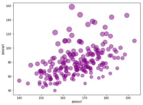
Now, let’s check a little advanced scatter plot with the same line of code.
This time I will add some color shades. I will male a scatter plot, putting weight in the x-axis and height in the y-axis. There is a little twist!
I will also add the length of the leg. But the length of the legs will show in shades. If the length of the leg is longer the shade will be darker else the shade will be lighter.
df.head(500).plot.scatter(x= 'BMXWT', y = 'BMXHT', c ='BMXLEG', s=50, figsize=(8, 6))

It shows the relationship between weight and height. You can see if there is any relationship between the length of the legs with height and weight as well.
Another way of adding a third parameter like that is to add size in the particles. Here, I am putting the height in the x-axis, weight in the y-axis, and body mass index as an indicator of the bubble size.
df.head(200).plot.scatter(x= 'BMXHT', y = 'BMXWT',
                          s =df['BMXBMI'][:200] * 7,
                          alpha=0.5, color='purple',
                         figsize=(8, 6))
Here the smaller dots means lower BMI and the bigger dots mean the higher BMI.
Hexbin
Another beautiful type of visualization where the dots are hexagonal. When the data is too dense, it is useful to put them in bins. As you can see, in the previous two plots I used only 500 and 200 data because if I put all the data in the dataset the plot becomes too dense to understand or daw any information from it.
In this case, using spatial distribution can be very useful. I am using hexbin where data will be represented in hexagons. Each hexagon is a bin representing the density of that bin. Here is an example of the most basic hexbin.
df.plot.hexbin(x='BMXARMC', y='BMXLEG', gridsize= 20)
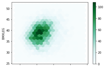
Here the darker color represents the higher density of data and the lighter color represents the lower density of data.
Does it sound like a histogram? Yes, right? Instead of bars, it is represented by colors.
If we add an extra parameter ‘C’, the distribution changes. It will not be like a histogram anymore.
The parameter ‘C’ specifies the position of each (x, y) coordinate, accumulates for each hexagonal bin, and then reduced by using reduce_C_function. If the reduce_C_ function is not specified, by default it uses np. mean. You can specify it the way you want as np. mean, np. max, np. sum, np. std, etc.
Look at the documentation for more information here
Here is an example:
df.plot.hexbin(x='BMXARMC', y='BMXLEG', C = 'BMXHT',
                         reduce_C_function=np.max,
                         gridsize=15,
                        figsize=(8,6))

Here the darker color of a hexagon means, np. max has a higher value for the population height(‘BMXHT’) for that bin as you can see that I used np. max as a reduce_C_function. You can use a colormap instead of shades of color:
df.plot.hexbin(x='BMXARMC', y='BMXLEG', C = 'BMXHT',
                         reduce_C_function=np.max,
                         gridsize=15,
                        figsize=(8,6),
                        cmap = 'viridis')

Looks pretty, right? And also very informative.
Some Advanced Visualization
I explained some basic plotting above that people use in everyday life when they deal with data. But data scientists need some more. Pandas library has some more advanced visualization as well. That can provide a lot more information in one line of code.
Scatter_matrix
Scatter_matrix is very useful. It provides a huge amount of information packed in one plot. It can be used for general data analysis or feature engineering on machine learning. Let’s see an example first. I will explain after that.
from pandas.plotting import scatter_matrixscatter_matrix(df[['BMXWT', 'BMXHT', 'BMXBMI', 'BMXLEG', 'BMXARML']], alpha = 0.2, figsize=(10, 8), diagonal = 'kde')

Look at that! I used five features here. I got the relationship between all five variables with each other. In the diagonals, it gives you the density plot of each individual feature. We discuss more on density plots in my next example.
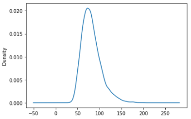
KDE or density plot
KDE plots or Kernel Density Plots are built to provide the probability distribution of a series or a column in a DataFrame. Let’s see the probability distribution of the weight variable (‘BMXWT’).
df['BMXWT'].plot.kde()
You can visualize several probability-distribution in one plot. Here I am making a probability distribution of height, weight, and BMI in the same plot:
df[['BMXWT', 'BMXHT', 'BMXBMI']].plot.kde(figsize = (8, 6))

You can use other style parameters we described before as well. I like to keep it simple.
Parallel_coordinates
This is a good way of showing multi-dimensional data. It clearly shows the clusters if there are any. For example, I want to see if there is any difference in height, weight, and BMI between men and women. Let’s check.
from pandas.plotting import parallel_coordinatesparallel_coordinates(df[['BMXWT', 'BMXHT', 'BMXBMI', 'RIAGENDR']].dropna().head(200), 'RIAGENDR', color=['blue', 'violet'])
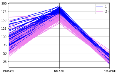
You can see the clear difference in body weight, height, and BMI between men and women. Here, 1 is men and 2 is women.
Bootstrap_plot
This a very important plot for research and statistical analysis. It will save a lot of time in statistical analysis. The bootstrap plot is used to assess the uncertainty of a given dataset.
This function takes a random sample of a specified size. Then mean, median, and midrange is calculated for that sample. This process is repeated a specified number of times.
Here I am creating a bootstrap plot using the BMI data:
from pandas.plotting import bootstrap_plotbootstrap_plot(df['BMXBMI'], size=100, samples=1000, color='skyblue')
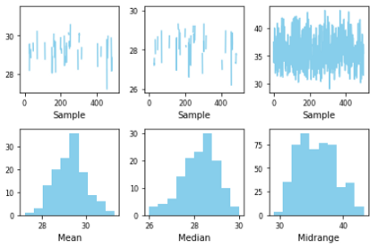
Here, the sample size is 100 and the number of samples is 1000. So, it took a random sample of 100 data to calculate mean, median, and midrange. The process is repeated 1000 times.
This is an extremely important process and a time saver for statisticians and researchers.
Conclusion
I wanted to make a cheat sheet for the data visualization in Pandas. Though if you use matplotlib and seaborn, there are a lot more options or types of visualization. But we use these basic types of visualization in our everyday life if we deal with data. Using pandas for this visualization will make your code much simpler and save a lot of lines of code.


No comments:
Post a Comment